On Thursday I screen-printed the posters I designed on Wednesday. The printing has not been going so well, mostly due to my rusty technique; I kept leaving the placeholder paper over the print causing ink to transfer onto the back of the screen, producing a ghost image on every print. Another mistake has been in choice of colour, this red that I have mixed is far to bright for the darker shades to come through, creating very little difference in tonal value. This washes out the image and makes it quite flat. I think im going to have to do some more prints early next week after all the snow.
This is the positive bitmap halftone of the poster, having seen the final product when using the light red I may have a shot at printing this in black, but I will have to do that next week.
Screen being exposed/
First batch of prints drying on racks. Its is here that you can see the way the faces are blotched out by the heavy bright colour. Another mistake I made way printing twice. When I have screenprinted before I have used vector images, which this practice works for. However with the very fine bitmap on this high resolution screen printing twice has caused the ink to bleed leading to a loss of detail and darkening of the mid-tonal values. This is all good preparation for the next batch of prints.
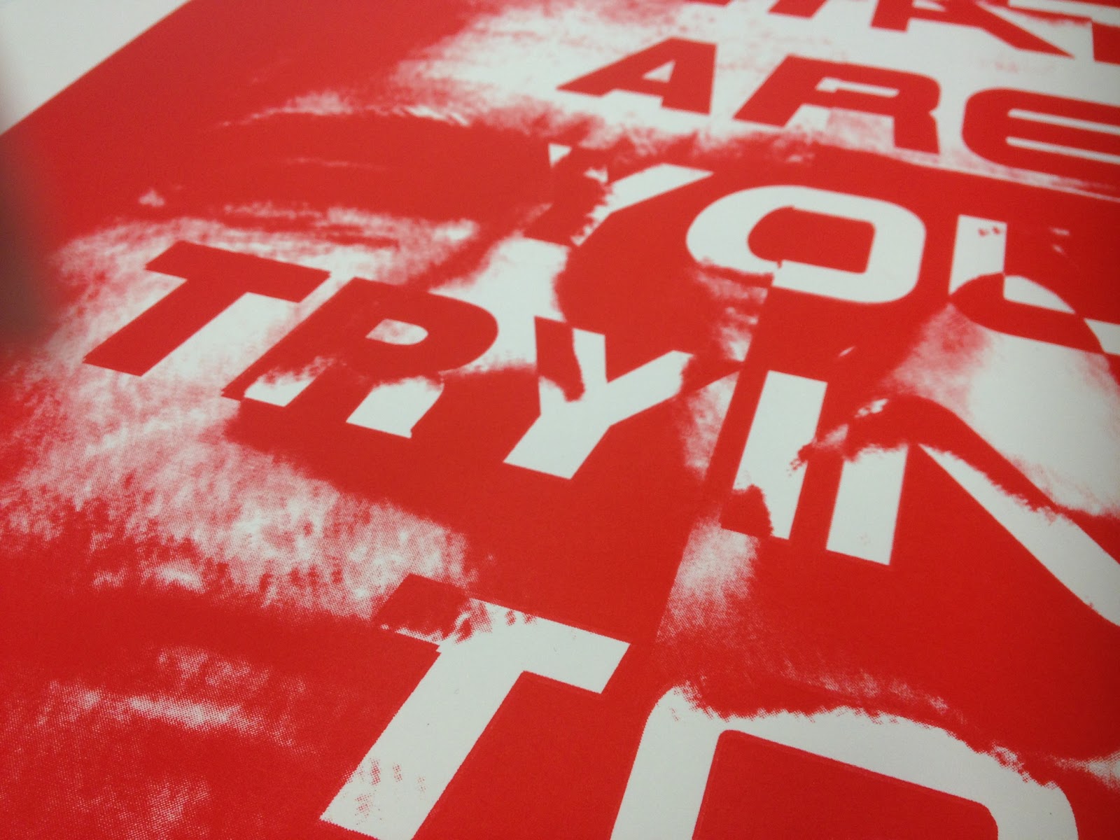
You can just make out here the ghost image caused by leaving the tracing paper placeholder over the printing paper, transferring ink onto the back of the screen. It appears here that it is the camera which is out of focus by in reality it is the result of bad printing.
Here I managed to do something even worse, printing twice because of the poor first print, the paper slipped substantial amount and created this.
More prints to come... Hopefully with better results.


No comments:
Post a Comment