These are the artboards I made for the presentation. They cover all the products I have made so far for this ISTD brief. There will be more prepared for the hand in, for example, an app or smartphone website.
I chose to show the website on two separate boards, this is because the website contains most of the content and interest. I didn't prepare any notes for the presentation but did run through a few times to get ready, I find too much planning and note making results in me choking up if it ever goes wrong. Whereas talking on the spot is much easier, as long as I have confidence in my work, and also results in a more friendly and personal presentation.
The second website board. This one has a few more of the type/face cards as examples. I used one of the original posters of Hugh Laurie as the background, in greyscale and tinted so It didn't totally swallow up the images.
This is the banners board, displaying a few of the banners in context. During the presentation I explained how each website will be a place typographers might stumble upon my site. Typography.com and Colors magazine because of their obvious connection to design and typography. Dafont because its a desperate place for design students to go and my website could offer a few better typefaces they already have. Finally USA today because it has set the new standard for news website layout design and designers flock there to find lovely codes and tips for their own sites.
The posters artboard shows one photo of the whole poster and a series of close-up images. My aim with the close-ups was to show the viewer the really fine halftone which was used for the screenprint. As a fan of screenprint I really appreciate seeing the print close up to get an idea of the texture and quality.
The dps artboard shows the Creative review style DPS I designed and wrote as part of the brief. Probably the simplest slide of the presentation it expresses my high hopes for the success of this theoretical idea!
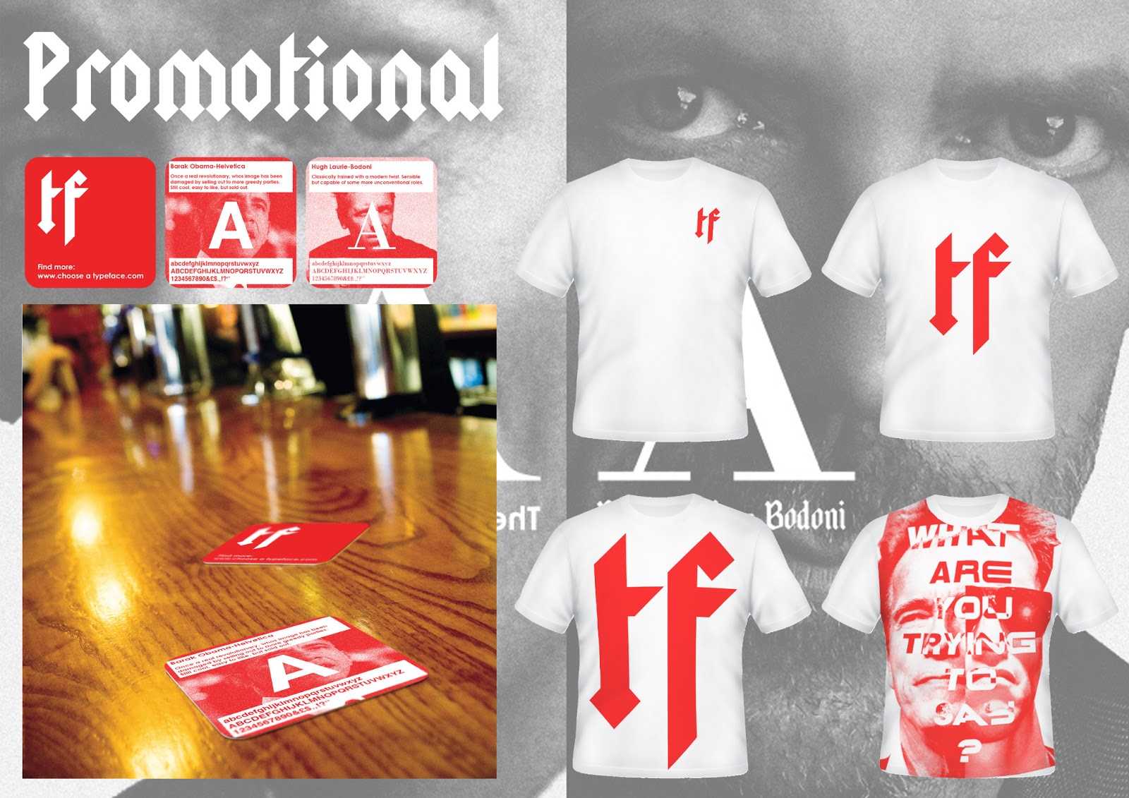
The last slide shows off some of the first promotional material for the website, firstly the collectable beer mats, then the fans t-shirt. The beer mats mock-up was pretty good quality so went down fairly well as I gathered from feedback. The concept of having the same slides as the website on one side meant the mats become informative and also point the reader at the website itself.


No comments:
Post a Comment