In this session we worked on each others concertinas, this post shows everything that was changed by others in the group.
This was changed, Im not so sure why, the paragraph was changed to two columns. This has broken the text up and made it fairly hard to read as the line length is too short.
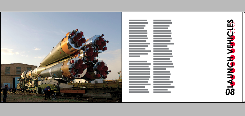
This image was stretched and shrunk which is suppose to fit it in the box dictated by the canon. This has caused the image to become stretched and its also too small. The text has also been stretched and lengthened. This will make the text harder to read also as the viewer can be drowned in text.
The concertina was also placed in a more correct format this allows me to understand how the whole thing fits together and design with more consideration fot the format.


No comments:
Post a Comment