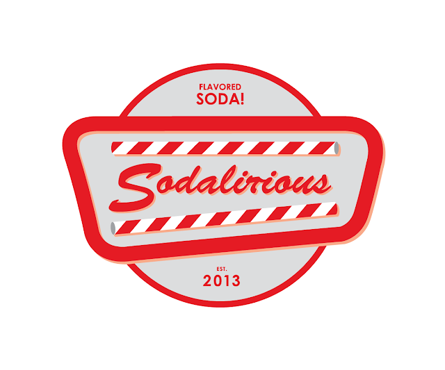
The client has expressed a desire for the logo to appear bound by a 50's inspired logo shape. I have taken that fairly vague description and have bound the text based logo within a shape which takes its inspiration from 50's motel or Vegas neon signage, which has a more innocent connotation in a 50's context. At first I also experimented with some race flag chequered patterns which are common in 'American Restaurants' over here in England, as well as the connotation of the hotrod drag race culture that is portrayed as being a 50's popular culture. However the chequered pattern described more 'fast food' than the Soda fountain feel I needed so I switched back to the solid line idea.
I have also added some stripped straws to the logo. I hope that the stripped straws could become a brand identity for the sodalirious company as they say they use them a lot. If they are also displayed prominently in the logo they can also become a brand identifier for customers. At this stage the logo is looking ok but needs some more weight for the scale it is going to be displayed at. Another major change I made here was altering the shape of the 'r' in the title. It is very easy to read 'Sodalirious' as 'Sodalicious', (which incidentally is a more appetising, albeit cheesy name) which is a really problem for the client to deal with. Here I have tried to reshape the 'r' so it looks more like and 'r' and less like a 'c'.
I added a circle to frame and centrepiece the main logo. This makes the overall logo appear more balanced and also gives it even dimensions. I also messed around with various drop-colours on the sign shape, including dropping it to the left and down as well as outlining the whole thing with the line tool. I also shuffled the size and shape of the various components to work out the best combination overall.
I finished with this logo design. I think encapsulates the 50's-Modern look the client had asked for as well as looking different from the competition. I changed the circle to a simple line which neatens the whole logo up and improves the dimensions of the design. I could also add in additional information like the date of establishment and the brands primary product. I added the 2013 date because the design is aimed at looking slightly retro, whilst the date drags the image back into the 21st century as well as being a little ironic in a hipster, post-modern sort of way.


No comments:
Post a Comment