Today I knocked up some designs for a space themed poster. I wanted to move away for traditional view of rain as 'romantic' and focus on something that would change the way people perceive rain with an amazing fact (I hope).
So I knew that water probably came from asteroids but I needed to do some further research and found out that the space objects stopped hitting earth about 3.8 billion years ago, proceeded directly with the birth of life on our planet, due to the water they brought. Ice comets disintegrated on impact bringing enough water to fill our oceans, although this is one of many reasons why there is water here, other resons include; volcanic activity released steam, water seeped out of hydrates in rocks, etc. None of these other explanations are as romantic or interesting as the space theory and Nasa appeared to back the asteroid/ comet theory too so I went with it. I also thought that the image of a comet flying through space could relate to the image of a rain drop flying towards the ground. I also learnt the difference between a comet and asteriod. A comet has a tail, which is more visually interesting and more suitable because from the research I gathered; comets are made from Ice water.
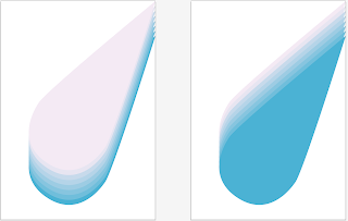
First task was to create a drop that had some motion to it, so I used a basic gradient with a single large raindrop illustration. I tried both ways round to see which was more suitable and picked a deep blue starting color which fades to a very light grey.
Added text to try and make the droplet appear more like a comet, trying to add some double meaning. I also added some diagonal lines to increase the perceived speed of the droplet across the page. The text sort of conjures up the imagery of old sci-fi films from the late 50's, talk of space also does this I think.
Neatened up the lines and sent them to the back of the image so the droplet/ comet can sit on top. I think the lines here are too overpowering in some respect and sort of ruin the poster, perhaps this is because they link up with the top side of the droplet but not the underside, which sort of throws the composition off.
Deleted the majority of the stripes, but left them at the top to fill the large blank space up there. I also added some text to a fairly large tab that pulls across the page. Here the tab is far too overpowering and the font does not fit on the page at all. I have also shifted the drop on the page so you can see the tail, it just looks more balanced like this.
To defeat this issue I added a fold to the tab to bring it forward while also shrinking its size back so it is not so dominant. Also changed the font to Clarendon (of costa) to give it a more factual-but-friendly feel.
I destroyed the lines and replaced them with a repeat pattern of more droplets at the same angle. I though this would bring a more even weighting o the poster and also fill a lot of blank space. I id keep two lines to frame the text however. I might still get rid of these because they do not match up with the raindrops. I also added 'according to Nasa' to the copy. This adds some credibility, but also subtly informs the audience that this is one of several explanations.
I like the poster so far, I want to build on it somehow. Maybe add more text of improve the imagery somehow...


No comments:
Post a Comment