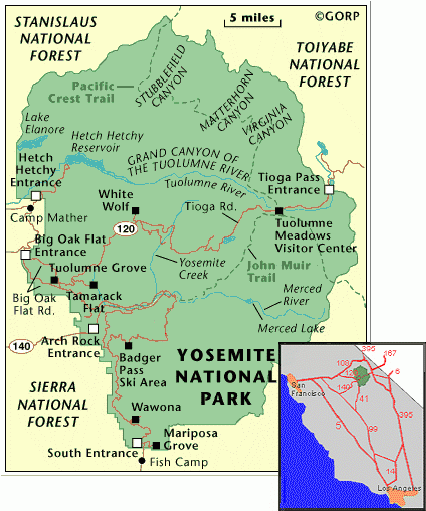
The third DPS concerns the locations of all the legal camp-sites in the park and the kit you would need to climb The Nose route up El Cap.
I used various maps of the region that I found easily google to produce my own map.
My version labels all of the roads, rivers, streams, landmarks and most importantly camp sites in Yosemite. I used the same colour scheme as the rest of the zine here also. I used different fonts of Rockwell for all of the labels to tie the design to the rest of the publication.
I made a few changes to the design before adding it to the page. For example, all of the location names appear inside the park now this means they can all be coloured a uniform white, leaving only the outside place names a dark blue colour. I also added the location of El Capitan to the map.
This is how the map fits on the DPS. Above two columns of text which explain the lack of hotels and the advantage of camping. The right hand page is a list of all of the recommended equipment needed for a quick team climb up The Nose route. The reminder text re appears explaining that this is only an example list and now all climbers are different and so on. I have also left a large amount of space to make notes and so on. The text here is much smaller than anywhere else in the publication. This is because I wanted it too all fit into one column to leave space. This may have to be changed later as it does not really fit in with the text on the opposite page. Up in till now all of the text has been at 16p with a 25p line spacing. When this is transferred into indesign I could alter this.
I should also explain here why there are very few headings. I thought that for such a short publication that headings would be unnecessary, so I left them out completely. Some things like the map are labelled for clarity but the list of equipment is obviously a list of equipment and the contents page clearly labels it also.


No comments:
Post a Comment