OUGD 504 End Of Module Evaluation
This has been one of the most challenging modules to date. I believe this is because of the combination of self-discipline, technical ability, design skills and solid research needed to complete it. In this evaluation I aim to outline; skills I have developed, strengths and weaknesses of work and methods used, finishing with some things I will do differently next time.
The most important part of this module has been learning the basics of HTML, CSS and web design. Knowledge of these two systems will probably be one of the most important skill sets I have ever developed. Carrying on with this development will continue for the rest of the course and beyond, but for now I am extremely happy to have grasped the basics and developed two working websites. Having worked on web design for only a few months now I have realised it is not half as difficult, or boring, as I thought it was before. If anything I really do enjoy sitting down and working out how to solve problems and improve the website, which has been total surprise to me. I have also, once again, worked with screen-print and continued to grow skills in this method of printing, especially in terms of printing with half-tone gradients, something I have never done before. This was a result of multiple failures, usually resulting in ink bleeding out definition in the images. Fixing this problem has been a huge step forward in my screen printing abilities and technique.
My strengths during this project have been centred in the development of my web-design skills, a subject which I took to much better than I personally expected. I was also happy with my creative responses and unusual solutions to tasks and problems, for example for the ISTD brief I created a website aimed at typography students and enthusiasts which could be used as a tool or for a bit of satirical humour. The brief was very open and could have been interpreted in a rather bland and uninteresting way, but I created something that I thought was genuinely useful as well as funny. I have also displayed a strength in presentation skills, although my slides and structure may need some more development I have developed the ability to stand in-front of the larger group and explain my work without breaking up or missing our informations, which is something I have had major problems with in the past. I put this down to having more confidence in my own work.
All of my weaknesses in this module have grown out of poor time management. Having total control over my own project management for the first time ever on this module has been a huge shock to my system, having realised how poorly I can manage myself without guidance. I have also realised how little I am able to work from home. This caused a huge backlog of work after the Christmas break, leading to de-motivation as I came to terms with how behind I was. Luckily I was able to sort myself out but I do worry that this work was too little too late.
Things I will do differently:
- Time management. I started out organised and ended the module organised but this was broken up by the Christmas break which saw me totally loose control of my work ethic and drive. Next module I need to get myself a diary and stick to it.
- Start with research. One of my main problems with developing a proper project and gaining full marks comes from not starting with research. I tend to come up with an idea and dive straight into it, then follow up with research. This often means that I stick to topics that I already understand of have a relationship with. This project was a little different because I realised halfway through that I was way out of my depth and I needed to simplify the idea, a direct result of not starting of research.
- Blog a post every day, If I manage to blog my work every day, working my blog like a daily diary instead of a weekly one I will be able to stay on top of blog posts. At the moment I tend to finish an aspect of a project and then blogs about it. This new regime should also allow me to do work even when I don't have too, if I have a day off I could blog about inspiration or contextual stuff for example.
- Blog exhibition visits and everyday graphic design I come across. I have realised that I have been to two gallery exhibitions of designers work during the course of this module and I have blogged neither of them. I need to stop considering the research element of these projects as a purely pintrest based pursuit.
Wednesday 30 January 2013
Sunday 27 January 2013
DESIGN FOR PRINT AND WEB// Smartphone and Tablet Versions
The Website will obviously have to be accessible from tablets and smart-phones so I have mocked up some examples of how the website could look if viewed on different devices...
 Here is an example of the full site viewed on an iPad, The columns would be shifted to three across rather than five if viewed in portrait mode or the original layout if in landscape. The giant buttons are really set up for tablet viewing so this would be a very easy site to navigate on this device.
 The iPhone version will have all the faces stacked up in one column. The user can quickly swipe through the list on this device.
I have kept the content as a website instead of developing an app because I feel that an app would be unnecessary when the user and promotion all points at a website.


I have kept the content as a website instead of developing an app because I feel that an app would be unnecessary when the user and promotion all points at a website.
Saturday 26 January 2013
DESIGN FOR PRINT AND WEB// ISTD Boards and Presentation
These are the artboards I made for the presentation. They cover all the products I have made so far for this ISTD brief. There will be more prepared for the hand in, for example, an app or smartphone website.
 I chose to show the website on two separate boards, this is because the website contains most of the content and interest. I didn't prepare any notes for the presentation but did run through a few times to get ready, I find too much planning and note making results in me choking up if it ever goes wrong. Whereas talking on the spot is much easier, as long as I have confidence in my work, and also results in a more friendly and personal presentation.
 The second website board. This one has a few more of the type/face cards as examples. I used one of the original posters of Hugh Laurie as the background, in greyscale and tinted so It didn't totally swallow up the images.
 This is the banners board, displaying a few of the banners in context. During the presentation I explained how each website will be a place typographers might stumble upon my site. Typography.com and Colors magazine because of their obvious connection to design and typography. Dafont because its a desperate place for design students to go and my website could offer a few better typefaces they already have. Finally USA today because it has set the new standard for news website layout design and designers flock there to find lovely codes and tips for their own sites.
 The posters artboard shows one photo of the whole poster and a series of close-up images. My aim with the close-ups was to show the viewer the really fine halftone which was used for the screenprint. As a fan of screenprint I really appreciate seeing the print close up to get an idea of the texture and quality.
 The dps artboard shows the Creative review style DPS I designed and wrote as part of the brief. Probably the simplest slide of the presentation it expresses my high hopes for the success of this theoretical idea!
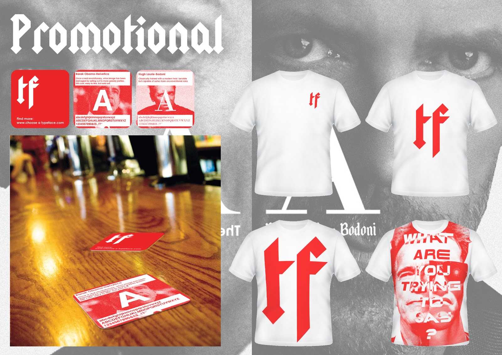
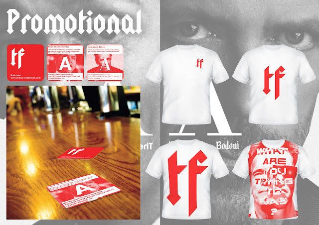 The last slide shows off some of the first promotional material for the website, firstly the collectable beer mats, then the fans t-shirt. The beer mats mock-up was pretty good quality so went down fairly well as I gathered from feedback. The concept of having the same slides as the website on one side meant the mats become informative and also point the reader at the website itself.


Friday 25 January 2013
DESIGN FOR PRINT AND WEB// ISTD Breif Beermats.
Beermats are a great way to sell an idea to trendy bar and pub goers, they mean I can really target people interested in design or typography by selectively placing them in the right establishments. The beermats will act as collectables and will have the same cards which pop up on the website on the front side and the logo and site name on the rear side. Below I have mocked up the idea and put the mats in context also.
 This photoshopped mock-up shows the beermats in context at a bar. I could see them in a few bars in Leeds for example wharf chambers, nation of shopkeepers, the sort of places where designers hang out really.
 This is the Type/Face logo and web address. This side is kept nice and simple, mostly because of the content heavy reverse side, if both sides were full of information people might think the website was a mess too.


 I constructed the idea in illustrator using the same images the website uses. This made sense because the users may read the content of the beermat and want to find out more. They could agree or dis-agree with the analogy made, either way they will hopefully find their way to the site and generate some traffic.


Thursday 24 January 2013
DESIGN FOR PRINT AND WEB// Type/Face T-Shirts
As another piece of promotional material i have decided to design some t-shirts for the website. These could be worn by people handing out promotional material like flyers or leaflets for the site or could be worn by fans of the site after it inevitably takes off and gains cult status.
 I went for the websites white and red colour scheme for the shirts also. The logo really stands out in this colour and has real presence even at a small size like this.

Medium centralised logo design.
 Large centralised logo design. This desigbn might prove to bee too much. Here I have noticed the logo colour look more like stripes unless the viewer steps back, this could work as an intersting feature of the design.
 The final t-shirt features the full poster design printed. In reality I would probably have to pay millions for the rights to the terminator image but it makes a nice mock up here. This t-shirt would be acceptable for someone promoting the website to wear, however most fashion concious designers or typographers or would-be fans of the site probably wouldn't wear this design on account of the massive Schwarzenegger heads.


Medium centralised logo design.


Wednesday 23 January 2013
DESIGN FOR PRINT AND WEB// Posters Photos
Final Shots of the screenprints. The posters goal is to spark interest in the website by using a well known figure who is seen to posses two sides. Here I chose Arnold Schwarzenegger for his role as governor of California as well as his role as terminator. Over the top of the split image of his two faces I have text which I think represents the personalities associated. Firstly a fat sans serif in italics, something similar to what Bush and McCain went for, as a republican candidate I thought it would suit Arnold here. The second is the typeface used for the Terminator films, futuristic, menacing and very 80s. The message here is 'what typeface are you going to use, because it can really effect the tone you come across in and what you are trying to say?'. This highlights the main principle of the website, to inform the user as to which typeface he or she should use depending on what the message is.
 Full length shot of the poster on my wall.
 Close-up showing the black poster on natural white stock.
 Close-up of red poster on bleach white stock.
 Black on natural white stock again, note the detail of the halftone and the very, very slight ghost image.
 Red on natural white stock

 I worried that the second side of the face, the terminator, is too dark to make out. However the iconic glasses and snare ensure most people will still understand the image. This photo also shows the separation of the two sides, If you put your hand up the the poster to only look at half you really get the impression they are two separate posters for different purposes. This has been the aim of the poster and I am very pleased at the outcome.


Tuesday 22 January 2013
TAO RESPONSIVE// Submission and Evaluation
My response to this brief has been bold and used the main icon of Taoism as its centrepiece. The circular logo actually started as a small icon or accent in a very text heavy logo I created for the first submission, the client responded to this and asked if I could take that shape and use it to construct an icon only logo. The logo is simple and bold and works in a range of colours although I have suggested this orange and white design as preferable. The Logo is also designed to work within the company name ‘TAO Leadership’, by replacing the ‘O’. I applied the logo on some business cards for the benefit of the client to help contextualise the idea for him. I hope that this way my design is looked upon more favourably amongst the competition. I have also shown the logo as part of a company sign and how it could fit on a letter as a header or a footer. The first submission for this brief was a very text heavy corporate design with a lick of colour that I thought would be enough to excite business consultants. I was wrong and they criticised the text heavy design but liked a small icon I had used in the centre, this became the basis for my second submission which works much better as a friendly and approachable logo. The good thing about this logo as expressed in the feedback is the subtle use of Taoism’s iconography, without making it super obvious or tacky. The Yin and Yang sign is used frequently by take-away sign makers with no style but I think I’ve managed to give the logo some distance from that by making it a stylised version with a good amount of white space to compliment it. The logo also looks a bit like a face, something which people can subtly pick up on as connotations for approachability and friendliness. It was a challenge for me to go ahead and submit this logo becuase I’m still prone to over-cook design, always thinking that more is better, when often cutting back an producing something very basic can be the way forward. I’m going to take this lesson and apply it to more and more work, becuase I think it allows me to step back and think of directions I can take a concept instead of directions I can take a design.
Monday 21 January 2013
DESIGN FOR PRINT AND WEB// Poster Screenprints No2
Today I went back into the print room and printed another two batches of the type/face poster. This time the results were much better, and much better than I expected. First I printed in 90%K, a slightly off black that I thought would allow for a good range of tone on the fine halftone without totally drowning the page.
.JPG)
.JPG) The black prints show a lot more definition when compared to the red prints I did last week. You can tell who the subject is much easier and the shape of the heads is more defined.
The black prints show a lot more definition when compared to the red prints I did last week. You can tell who the subject is much easier and the shape of the heads is more defined.
 I also tested printing in this new red. It is a mixture of the black above and the red I mixed last week for the previous prints. With the new clean screen and the knowledge not to print twice the result is much more refined and legible for the viewer. This colour provides the clarity of the black print with the colour theme of the website and the brand type/face.
.JPG)
.JPG)

Sunday 20 January 2013
DESIGN FOR PRINT AND WEB// Web Ads for Type/Face
The best way for new websites to generate traffic is to spam people with web ads. Put them up in places where designers, typographers and graphics students hang out on the web and shove your website in their collective faces. Here are some web ads I have put together...
 These web banners are based on early posters for the project and feature a similar principle to the poster. Basically two sides of each famous individual is shown, here it is Hugh Laurie, firstly as the young classically trained actor and then as the more modern character House. The typefaces that overlay his face show the same transition from classical to the more modern yet refined Bodoni. This sums up the principle of the website so if any passing internet traffic is interested hopefully they will click through.
 Here is a more political based ad, aimed at generating traffic from news sites, hence the extra content explaining the purpose of the site rather than leaving it to the user to find out as above. Here Obamas two sides are critiqued, with the text saying 'A revolutionary, sold out'. The idea is that people may agree or disagree with this statement and click on the link to find out more. The fonts are reflective of this statement also as the first is Akzidenz Grotesk and the second is Helvetica.
 I also made this side bar banner for use on pages which support this format. It is the same Hugh Laurie poster with the address and the logo above.
 I've mocked the side bar ad into DaFont. The idea here is to pick up any student designer traffic who might be stuck on choosing the right font. They would go to the site and use it as a real resource. The ad also really fits in with the overall aesthetic of DaFont so people could think its an awesome new feature!
 This mock-up shows another ad in Colors Magazine's front page. They keep ads off the top of the front page so this one is place near the bottom of the page on their 'network' tab. The idea here is to catch designers who would find the site a bit of satirical fun as well as a possible tool.
 I have placed the Obama ad in a USA Today news story. This should appeal to the more politically minded and trick them into coming over to my typography site! HAHA! Seriously though it may get some interest from those looking to make protest banners, articles of there own or any other typography based publication.
 The site could rally get propelled if the blogosphere gets on it, by placing ads on popular source content sites it could get picked up by big name bloggers and catapulted into infamy.


DESIGN FOR PRINT AND WEB// Website
In the past few days I have made some major progress with the website.


<a href="../images/powerspop.png" rel="lightbox"
before the rollover image code.
I also editied a small amount of the lightbox.css file so that the website was not greyed out when the lightbox was open by changing the opacity values for various web browsers:

========================================================================


========================================================================


Here are some other examples...


The tone of the website is 50% humour and 50% informative. Every link is in some way satirical but also factual for the user. I chose to do this because the topic could be incredibly boring without something to lighten the mood, also a lot of the characters, by their very nature, bring humour to the page.
At the moment I think the website is a success. If I were a new graphics student it would be good to know that I don't need free fonts off the internet and that there will be fonts on the college computers which have the ability to convey nearly every tone you need. Also for seasoned designers the website could be seen as a bit of work based humour, however im not going to pretend that I fully understand the subject so there could be some disagreement with some of the choices, but I would be happy to argue my decisions. For example, in reality cooper black was designed in the 20's so to some it will always be associated with the Art Deco movement, however I would argue that it connotes 60's and early 70's swinging subculture to most people today.
Saturday 19 January 2013
DESIGN FOR PRINT AND WEB// Magazine Article DPS
The magazine dps is a fairly cheeky idea of mine to design a dps article about my website for creative review. The idea here is that at some point the website could theoretically gain some attention and feature in one of the leading design magazines. This would offer a huge opportunity to sell the website and generate more unique visitors.
 I've mocked up this new feature for creative review called 'NSR' where every edition will feature a new site which is reviewed with a small interview of the sites designer or team. Below the header, which appears centre page, is the web address.
 Along the outer edge of the page I have placed the website header. This should generate a visual link between the site and this article. I've flipped this image on its side for demonstration.
 The article has splashes of red throughout, in this image you can see the use of different fonts in the body copy to illustrate the fundamental principles of the site (unfortunately the font zapfino was lots in this screen shot, but it still appears in the final product.
 On the second page I have added a huge Type/Face logo and some images of the website in action, as well as some more body copy. The colour theme continues here as well as the overall visual style.
I believe the dps would theoretically generate the most interest in the website if it existed in reality. The target audience would be right there reading about the site and could spread the name about colleagues and perhaps students.


I believe the dps would theoretically generate the most interest in the website if it existed in reality. The target audience would be right there reading about the site and could spread the name about colleagues and perhaps students.
Subscribe to:
Posts (Atom)