Sunday 31 March 2013

DOS VECES RESPONSIVE// Poster Part 1

I used the sketches quite literally and started designing the posters using them. I have started here with the background which is quite simple at the moment but expresses the right colour and shape of what I want to come up with finally.
Here I have added a hand making what I believe to be a hand signal which could either represent the number two (like you would order two items in a crowded bar) or a peace sign. I need this ambiguity in the design to express two different meanings because double meaning and history repeating itself are the central themes of the film. I have also got a desire to express this duality theme in the title text. Dos Veces means 'Two Times' I plan to take this literally and write it out two times as well.

Adding the title twice also frames the hand quite nicely and adds some energy and to the page, the viewer will read the title twice and have to scan all over the poster. I also believe that by reading the title twice the viewer is more likely to remember the name. In the last poster I cut the title in half, mostly so the poster was less uniform and symmetrical, which I do not this suited the overall dynamics of how it was put together. I have also used this font called headlines, which I would normally avoid at all costs, however I think it has a place here in a Cuban setting. Its thick and messy style is something that you often see in Cuban poster art however it is just refined enough to be read clearly and not make the poster seem all to childish or fun, which the client absolutely does not want.

Saturday 30 March 2013

WHAT IS GOOD?// Making the Research Book Indesign

The research book is a short explanation of all the knowledge and information I have gathered up for this UKSA brief.The booklet will be around 22 pages long and every DPS will follow the same format of the left page having a huge full page image and the right containing information about the given topic. The page numbers count town to 0 for the first section of the book where I am explaining different topics of technical research then count up from 0 when I move on to my future plan for the rest of this module.

The front cover of the book is very simple, but without further branding for the UKSA yet to would be pointless to go to over the top. The design here is similar to one I have on the front of my Responsive module handbook, so it could be said that it is a personal product style that I am developing.

The grid is very simple and does not contain any horizontal marks, I want the book to have a very simple layout and using this grid will make sure it happens. An image will fill the whole left side while text will be split into two columns on the right, with the furthest column dedicated to the title of the page and the page number.


I will upload the Issuu PDF soon so you can read through the who booklet here, it covers a very broad topic and focuses on a very few and specific aspects of that topic so the research booklet in my opinion could be a lot better, however this would take years and years to achieve given that I am writing about space exploration.
 Stylistically I am happy with the way the book has turned out. It will be a while before I print it at this rate but I should wait till then to write an evaluation. Saying that I like the size of the pictures, they inspire as much and the text content, the layout is simple but effective at this.

DOS VECES RESPONSIVE// Brief and Sketches

Dos Veces means “two times” in Spanish. This short film is based on the true story of Cuban refugee during the take over of the Castro regime in 1959 and how is experiences and stories affected his children and grandchildren. This poster should evoke the drama and truth that the film approaches in a cinematic manner while maintaining the influences of true Cuban culture and history as perceived by a Miami audience today. The target audience set out by the client are adults based in Los Angeles and Miami aged 21-50 that speak English and Spanish and are in the art and entertainment industry. The poster must evoke the style of Cuba in the late 1950’s while staying true to current day culture/style for 20-somethings in America. Most importantly the poster must communicate in a sort of serious, almost stoic style that could possibly evoke a melancholic reaction, whilst also remaining entertaining for the viewer.

My first sketch is an idea for a beaten and wrecked poster plastered on an old colourful-but-faded concrete wall, as you might find in Havana. The main theme of the poster is a play on the imagery and the concept of the film. A man's hand will be signing the peace sign in the centre of the poster, but it will be hard to tell if he means 'peace' or if its to signal the number two; as the film is called 'Two Times'. This will hopefully express the duality of the film and its running theme of war and relationships.
The second sketch is an Idea for a much more refined and photographic poster. In this idea a flagpole flies two flags, one for Cuba and one for the USA. Again this will relate to the title 'Two Times' but in a more direct way as the history of the grandfathers past in Cuba is applied to the current day problems of the grandson in Miami.  In both these posters I plan to use a rather chunky typeface, firstly so the name is clearly visible and secondly because of the Cuban style for a heavy slightly unrefined typeface.
The third sketch just brings a few of the ideas together, I did add a small motif to the top of the flags and that idea could stay, It represents the link and strained relationship between Cuban and America as well as the two main locations of the film. The hand also stays but the background should be more colourful and stylised in a 50s Cuban propaganda sort of way. The brief expressed a desire to look 50s and Cuban so I thought that the star and red, white blue colours might reflect this from some research, which should be posted over on the DC blog soon.

Wednesday 27 March 2013

SODALIRIOUS RESPONSIVE// Submission and Evaluation

This circular logo is a mix-match of different styles and colours taken from 50s American design, specifically Californian. I have aimed for the desired ‘50’s Modern’ style and created a vector logo which could be applied to a wide range of products at any size. I have included stripped straws into the logo which I hope will become a company icon and ensured that it will appeal to families and those looking for a bit of fun. All colours are matched to the Pantone Solid Uncoated swatch. I have used two fonts; Century Gothic Bold and Brush Script Std Medium, which I have edited very slightly so the ‘r’ in Sodalirious is not confused for a ‘c’. Both fonts are also widely available. The decision on who won this brief is still pending and the nature of the brief itself is down entirely to personal taste. To design this I thought about what I would want to see if I were in a very hot city like San Diego looking for something refreshing to drink. I think the Logo is successful is getting the ‘Drinks!’ message across with the straws and Soda! text. The 50’s Modern look is open to debate, I personally think that this Logo works well in this respect purely becuase of the colours and imagery, like the neon roadsign shape in the middle and the script font. The downfall of the logo in my eyes is the fact they wanted a script font. Script fonts, when applied to such confusing names, SO-DELIRIOUS, can cause people to ignore the name entirely. I often read the name as ‘SO-DELICIOUS’ and I think most other people will too.

Thursday 21 March 2013

SODALIRIOUS RESPONSIVE// Bottlecaps and Small Label

In addition to the main logo the client asked if we ensure it can be dismantled for a smaller version which would be used on bottle caps or small items.
Using parts of the main logo I made this cut -back, smaller version. This version is also a monotone vector so could be applied to a range of materials and printed cheaply. I made sure that the straws were still visible and that the name and iconic sign shape were the main focus.
I did try out slightly more detailed designs using these bottle-caps to mock up these other versions for testing. This just proved to me how the less detailed version was the best to move forward with when working at a much smaller scale. A lot of the detail is lost on items this small and I can imagine printing costs being much more expensive for multiple colours on items like this, as we were informed by the guys from Hellfire.


TYPE AND GRID// 4th Session

In this session we worked on each others concertinas, this post shows everything that was changed by others in the group.

This was changed, Im not so sure why, the paragraph was changed to two columns. This has broken the text up and made it fairly hard to read as the line length is too short.

This image was stretched and shrunk which is suppose to fit it in the box dictated by the canon. This has caused the image to become stretched and its also too small. The text has also been stretched and lengthened. This will make the text harder to read also as the viewer can be drowned in text.

 The concertina was also placed in a more correct format this allows me to understand how the whole thing fits together and design with more consideration fot the format.

Tuesday 19 March 2013

WHAT IS GOOD?// UKSA Research Presentation

SODALIRIOUS RESPONSIVE// Logo Building

The client has expressed a desire for the logo to appear bound by a 50's inspired logo shape. I have taken that fairly vague description and have bound the text based logo within a shape which takes its inspiration from 50's motel or Vegas neon signage, which has a more innocent connotation in a 50's context. At first I also experimented with some race flag chequered patterns which are common in 'American Restaurants' over here in England, as well as the connotation of the hotrod drag race culture that is portrayed as being a 50's popular culture. However the chequered pattern described more 'fast food' than the Soda fountain feel I needed so I switched back to the solid line idea.
I have also added some stripped straws to the logo. I hope that the stripped straws could become a brand identity for the sodalirious company as they say they use them a lot. If they are also displayed prominently in the logo they can also become a brand identifier for customers. At this stage the logo is looking ok but needs some more weight for the scale it is going to be displayed at. Another major change I made here was altering the shape of the 'r' in the title. It is very easy to read 'Sodalirious' as 'Sodalicious', (which incidentally is a more appetising, albeit cheesy name) which is a really problem for the client to deal with. Here I have tried to reshape the 'r' so it looks more like and 'r' and less like a 'c'.

I added a circle to frame and centrepiece the main logo. This makes the overall logo appear more balanced and also gives it even dimensions. I also messed around with various drop-colours on the sign shape, including dropping it to the left and down as well as outlining the whole thing with the line tool. I also shuffled the size and shape of the various components to work out the best combination overall.

I finished with this logo design. I think encapsulates the 50's-Modern look the client had asked for as well as looking different from the competition. I changed the circle to a simple line which neatens the whole logo up and improves the dimensions of the design. I could also add in additional information like the date of establishment and the brands primary product. I added the 2013 date because the design is aimed at looking slightly retro, whilst the date drags the image back into the 21st century as well as being a little ironic in a hipster, post-modern sort of way.

Monday 18 March 2013

SODALIRIOUS RESPONSIVE// Brief and Ideas

We need a logo design for a new company based in San Diego, California, The USA called Sodalirious. Sodalirious is a mobile “made to order” soda making flair (flair bartending) team that creates the any flavour the guest wants. We have a 1950’s soda fountain feel and costume with stripped straws. We need a clean and presentable logo, and will be basing some web design around it. There are no company colours but we would like the ability to resize the logo without losing any sharpness or quality so we can print a business card to a giant banner. -Sodalirious

The emphasis must be on a “50s modern” look (50s Post-Modern then). Most of the research carried out will be focusing on 50s American design and we all know what that looks like. The client has also specified that they do not want anything to look too much like coca-cola however all of the examples of interested design is red with a script font. This logo will have to be a satire on 50s iconography and should work in some more personal brand related icons also.

Here I have put together some very preliminary design, and concept ideas and experimented with some typefaces which could be used in the design. I have also bought in a load more images and design inspiration which I can use to set the tone and help with the design of the logo itself.

Sunday 17 March 2013

LEGO RESPONSIVE// YCN Submission and Evaluation

My response to the brief was an idea taken from Lego instruction manuals. With a Lego instruction manual a young child can be told how to build an extremely complex model without a single paragraph of text. This imagery is what I tried to exploit in my own design becuase I know how powerful and effective it is. With this concept I made a bus banner advert and a city poster, they are instruction manuals on how to make people happy with lego. I have added the tagline ‘Start Building Fun’ and linked each word to an illustration with numbers, this relationship between text and image expands the posters connotations to; ‘Start making Lego, Build something imaginative and have Fun with friends doing it.’ The aim of the simple design style was to get Parents nostalgic about playing with Lego as children, in the hope that they will buy some Lego for their own kids. Additionally the designs work as basic promotion and the solid iconic imagery can be noticed by anyone. I also mocked up some in store front promotion, in the form of shopping bags and box art. The same principles apply to these, and are intended to be taken home and kept. Lego is a brand I respect hugely and I really thought I would enjoy generating Ideas for them. At the end of the day this was not really the case and my familiarity of the brand made it incredibly difficult to come up with anything particularly new that I could be proud of. This caused me to reject Ideas before I had really experimented with them and once I had an idea I was happy with I found it difficult to improve or expand the concept in any meaningful way. What I like about the designs I ended up with was the clean balance or colour and white space mixed with a slightly retro style. I also believe the posters would work well on anyone who has played with Lego before an used the instruction manuals. On the other hand in terms of submission the idea is not big enough and although I have theorised over one good idea I could have produced more work over the Christmas break and developed the whole thing a lot further. I would have liked in retrospect, to produce a larger instruction manual book which could be packaged with Lego products and act as a history book and procure.

Saturday 16 March 2013

FEDRIGONI RESPONSIVE// YCN Submission and Evaluation

Our Response was to create two 21 page publications. Each leaf is a delicate and detailed cut out which creates an epic Northern Italian vista. Every page in the publication covers a different topic, for example, the history of Fedrigoni, the affordability of the papers and there environmental policy in South America and Europe. We have built the books out of a wide range of stocks which represent the wide range of Fedrigoni papers in different colours and weights. The covers are a slightly heavier black card with Fedrigoni’s name and branding embossed into them. We also added a protective tracing sheet to each publication so the cut out design will not get ruined during handling but to also add another aspect of mystery and craftsmanship. The publications are Japanese bound with pva and tape reenforcement.  The publications were extremely successful from a crafting point of view. Through many difficulties and set-backs we managed to create two incredibly intricate books that have remained sturdy enough to be used in real life. In this respect I am proud of our achievement, and response from peers in our year group has been excellent. From our ‘clients’ point of view I can also imagine positive feedback for the concept, imagery, crafting and layout. However I feel that there are some downsides to the end product, for example the scene could be seen as a return to the ‘high-end’ image of North Italy that  Fedrigoni specifically asked us to shake off. I tried to combat this with slightly brighter colours and a more playful look and feel, whilst Ste went for a more reserved realism. We did say that this shows our concept could be tailored for different printers, a certain type of mid-range printer could receive my  book whilst a high-class printer could receive Ste’s, In reality it does highlight that we may have differed in personal taste and built two books because we were both too stubborn to change our own designs. At the same time we welcomed the challenge and made sure the covers and layout remained identical to ensure the two publications work as a set. We also worked together well and carried out the vast majority of our tasks at a team, we researched, theorised and planned everything together and helped each other make our owns books. Without the combination of both our skills there is no way we could have make these books in time or probably even taken the plunge to run with this whole idea at all.

Friday 15 March 2013

FEDRIGONI RESPONSIVE// Second Day of Binding

Yesterday morning we had to return to the print rooms with our re-cut fedrigoni logo on MDF. We used the template from the day before to measure out the same dimensions and gauge the correct positioning and fixed the wood to paper with mounting spray.

We used the same hydraulic press as before and with the stronger material we got a much more detailed and deeper emboss. We also bound the cover to the rest of the book with pva glue and double-sided tape. This gave a cleaner, but sturdy finish to the bind. We also managed to get the two books looking identical so they work as a set. I am pleased with the binding of the books, my only (small) complaint would be that the pva has warped and liquified the paper on the spine slightly meaning that it has stretched and does not fit as snuggly as I imagined, however given that the book is handmade we couldn't have hoped for a better result. If we had much longer I would have liked to add twice as many pages to the design, I think this would produce much more substancial books and increase the feeling of importance just through the weight and feel. However these books are still inspiring to pick up and look through, they show off a range of stocks in an impressive way and are full of information and history.

Wednesday 13 March 2013

FEDRIGONI RESPONSIVE// First Day of Binding/ Embossing

Binding the book is the part of the process that neither Ste or Myself have any experience in. This is also cutting the submission deadline really close so to add to the pressure we really need to get this right first time. Luckily the tutors down in Vernon St helped us with every step.

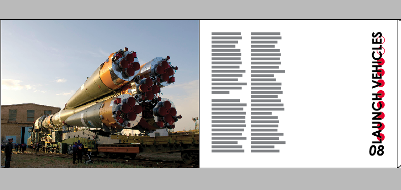
I started by reprinting this page, which I had laminated because of its dark colour. In the process of doing this I had cut the page too small for binding so it had to be printed and cut again. I managed to cut this page out again by hand with a scalpel, luckily it was a hill with very little detail.

Our first step was to trim each page along the spine and mechanically fold each page. This would allow us to bind the book and trim the rest later. The fold is placed 2mm away from where we will drill the holes for binding and will allow the fairly fragile pages to be turned without bending the design.

We did have a look at various covers and binding methods. We chose go go for a japanese bind with a cover. The cover would hide the stitching and could be applied after we embossed it. 

We used this mounted drill to drill holes through the book. We also used a template measured out on cardboard to help us drill in the right places. However with some confusion over the size of the book we had measured the holes relative to the size of the A4 sheets the book was printed on and not the actual size of the trimmed book itself. This could have been a disaster but luckily no holes were too close to the edge of the correct dimensions, we halved the measurements and drilled again. 
The second and correct drill measurements...

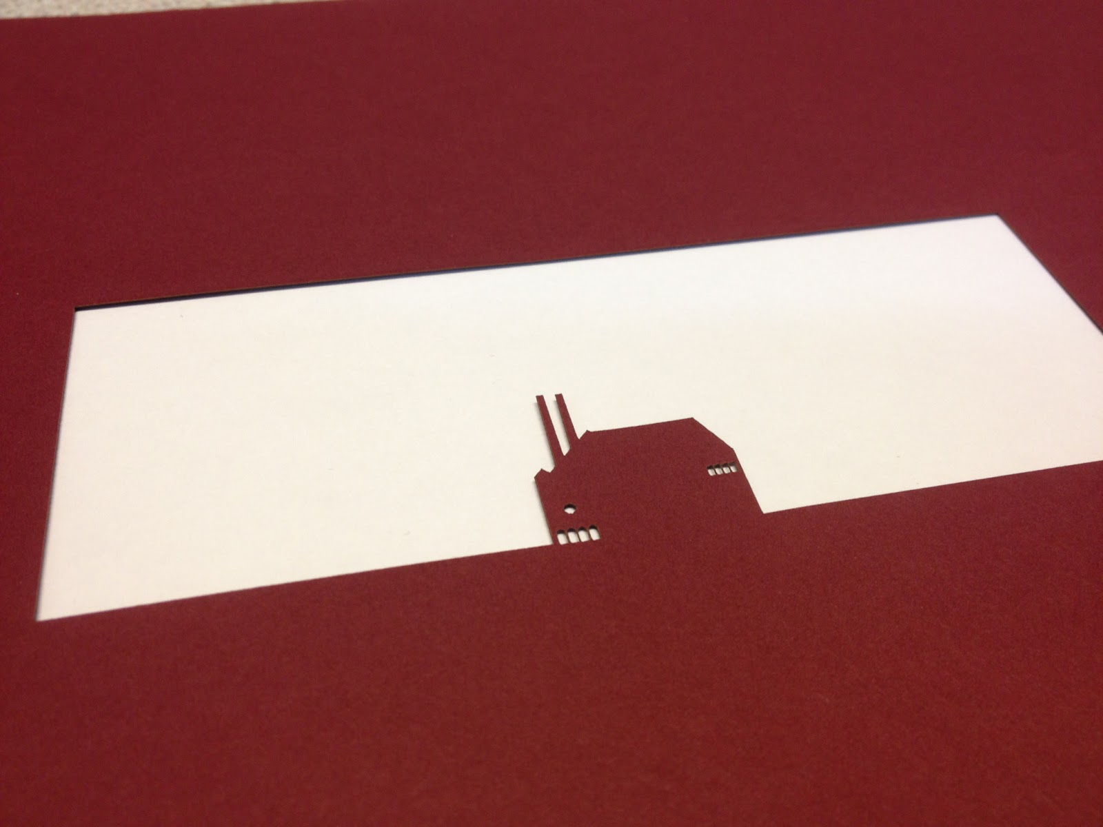
While we lasercut our books we also managed to lasercut some mount-board for the embossing on the front cover. We used mount-board because the print tutors up in Blenheim Walk suggested it, however the more professional equipment down in the old college basically just crushed the mount-board and the embossing was way to faint to even take a picture of.

However we did do a lot of measurements which we can use again and it was great practice for the real thing, which we will have to do tomorrow now, after cutting some more covers out of MDF.

We tried to emboss on this hydraulic printing machine down in the Rossington St print room. We will use it again tomorrow for the second attempt at embossing.


Tuesday 12 March 2013

FEDRIGONI RESPONSIVE// Lasercutting

This morning We finally got to laser cut our final designs. We were making two books so took one machine each. The Process was not without problems and took a huge amount of time to set up initially, however we sped up as our confidence grew. The main concern here was that if there were any problems we wouldn't really have any time at all to correct them, the submission is in two days and the building of the book has only just started, many of the pages cant be replaced and printing has taken a huge amount of time, with the studio printers out of bounds due to interviews.

Despite taking a huge amount of care to get the cut right I managed to destroy the first two pages as well as the page with the paper mill on. The first two (green) were down to setting up the laser cutter incorrectly; it cut in the wrong place. The paper mill page (red) cut the negative of what I wanted it to be. This was due to importing the wrong illustrator file after some last minute changes. Amazingly all three pages could be replaced from the library stock so all I had to do to replace the pages was print them out and drop in over lunch.

My final book beside the pages I cut incorrectly.

Even with missing pages I could see how the scene could fit together, here the hills are taken apart and the mill is still missing.

At lunch I managed to get the missing pages re-cut and added them to the book. This image shows the final design ready for cropping and binding, which we have already started today. I will write a full analysis of what I think in a later post but for now I'm really impressed with how the book has turned out.

Monday 11 March 2013

FEDRIGONI RESPONSIVE// Paper Selections

Over the weekend I went to hobby craft and bought a good range of stock at different weights, textures and colours, these combined with the samples Fedrigoni have sent us and stock from the library have given us a good range of coloured paper to use with our two books. We had 42 sheets to choose from and picked out colours together based on our illustrations, choosing diplomatically who received which colour whilst also, usually, always getting the colours we wanted. This is a photo of the colours I have picked from the black cover colour all the way to the blue sky page at the rear. We managed to match each layer to an individual colour of paper so if the pages stay in order the scenes should look great.

FEDRIGONI RESPONSIVE// Type Layout + Grid

 The grid we drew up for the fedrigoni book appears to be fairly complex, however it is very simple in reality. Most of the construction indicates where we need to cut the design, where it needs to be bound and where it will be trimmed in relation to am A4 page, which the text will be printed on before binding and trimming.

 We chose to place a the Fedrigoni shield at the top of each page, this will ensure the viewer never forgets the paper brands identifier. We also made the conscious decision to place the text to the right of the cut out design. We learnt in the construction of the prototype that if this were the other way around the page could be ripped easily while being tured, additionally the text could be hidden in the binding if we choose to japanese bind. We have left the left margin flexible in size for this reason, we are not sure how we wish to bind yet, as we do not know enough to made a decision like that on such an unusual book before everything is ready and we talk to someone with more experience down in the print room.

Our books are slightly different lengths due to the different scenes we have created. Mine is a few pages longer so I have added this final page of contact details to the book. The action plan is to meet tomorrow for an early morning printing session then lasercut at 11.

Friday 8 March 2013

FEDRIGONI RESPONSIVE// Practice Lasercutting

We used todays laser cutting session to test wether the laser cutter would destroy our fairly intricate designs or not. The practice cuts contain all the detail of the final version however the box which constrains the cut a different size on each page at the moment, something we need to change urgently now, on both of our designs.

All of the layers have cut very well. I picked a selection of layers which contained a good range of different elements in the design. This way we could see if any of the small details would be cut to thin and drop off or set on fire by the laser. This test was on library stock, however we want the books to be cut out of a nicer and larger range of stocks, so despite the usefulness of the test we still dont know for sure wether the final editions will work until we actually make them.

On another note, this was the first time I have used the laser cutters properly so its been a really steep learning curve for myself. I feel pretty confident with them now so I wont have to try and learn anything whilst producing the final editions of the book. This image shows the three layers we test cut on top of each other, giving an impression of what the scene could look like. I still think the colours need the most attention at the moment (Im going to hobbycraft tomorrow) however it is good to see the style is simple but the intricacy is also visible.

This final image is Ste's front layer. It will frame the rest of his image while my frame is still a solid line box. This brings up an interesting dilemma, where we need to make sure that our books look identical from the outside because they wont once the cover is open. We will also have to make sure the text and typesetting is identical to tie the two books together. If we can do this then the books will work as a series instead of two separate publications.