Sunday 30 October 2011

ALPHABET SOUP// Workshop - Illustrator 3

For the final design of this Brief I have added the letters to a portrait A1 format on a 4x8 grid. This will be the way the designs will be printed.


This first screenshot shows how I have added a strange perspective grid too the design, the aim is to  Add another dimension for the typeface and try to make it look more three-dimensional.

So here is what may be the final design which I print off. The only issue I have is that the text looks fairly thin and I don't want this, I also wanted to add some motion or boldness to the design.

So I may decide to print off this version, the text appears to be much bolder and the double layers create a sort of vibration or suggestion of motion in the letter. I can't decide if this is a terrible idea so I will make a decision closer to the deadline, however I really like this as an experiment, and I wonder what it will look like in a printed format.

Saturday 29 October 2011

ANATOMY OF TYPE// Part 3 Weights

 Following up on the previous tasks for this project I have developed three different weights for one of my new letterforms.  This letter 'E' now comes in extended regular, extended bold and extended light. I have also created regular versions of each and condensed versions of each but for some reason I must have left them in the studio so I will update with more photos soon. Here are the extended versions:


ALPHABET SOUP// Workshop - Illustrator 2

This is a walk-through of how I constructed the illustrator based typeface. I actually ended up doing this in quite a convoluted way, i could have just applied a preset fill pattern I could have designed onto each letter. However trying this I realised that this method was fairly uniform and the lines in each letter looked like a mirror copy of the last, As I wanted each letter to be unique I decided to design each one from scratch:


Firstly I typed out two letters in lower case, then layered them perfectly on top of one another.
I then added the lines, following the shape of the letter, they all spawn from one of three points and will continue outwards until they hit a wall of the letter.

At this point I hid and locked the lowest layered letter, I did this because I would need it later untouched and in precisely the same position. 
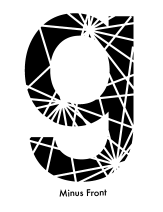
Here I used the Minus Front tool to delete the lines and the paths they left through the shape f the letter.
Then I drew a black box around the letter, this would act as a mask with the aim of reversing the colours underneath.
Selecting the box and shape I used the Exclude tool to cutout the shape underneath. The letter, lines and box all now become part of the same shape.
The next step uses the letter I hid earlier, I unlock and show the letter so it can be used as another mask to delete the black box with.
Here the Intersect tool is used to cut away the black box and the second letter, leaving just the lines and the faint outline or the original letter left. This is the end of the initial process however the letter still needs some editing yet, for example destroying the faint outlines of the letter so that only the random lines remain.


This is a screen I took halfway through the initial process, it shows the 'exploding lines' I used in the design as well as a before and after of the process.

Finally I added Glyphs to the typeface, these are the same as the glyphs I added to Eve's typeface and follow the same design process as the letters. I like the typeface as it is so far, and i thing it can relate the word 'POP'. However I feel that it could really be improved if I added some background decoration or context to the design. I feel once it has been placed in a more attractive environment the whole font will be pulled together.

Thursday 27 October 2011

ALPHABET SOUP// Workshop - Illustrator

Today I made some experimental letters for the Illustrator Brief. Using Illustrator as a sketchbook is quite easy however I have an annoying tendency to delete ideas I don't like or think have failed. This means there is very little evidence of my exploration of ideas. To fix this I began taking lots and lots of screenshots, here are some of the ideas I was playing with earlier.


These three designs began as my favorite idea, however the more I experimented with different layouts and letters I realised that the pattern would not look uniform across all the letters, some would be heavy set and others barely readable. Also I do not like it aesthetically, there is not much going on and it is fairly hard to look at. 
I really liked the hand-drawn version of this I drew for the initial alphabet soup project, my word I had to follow was 'POP'. The theory is that lots of minor 'explosions' are spreading trails across the negative space left by a the shape of a letter, when they hit a side they stop. As there are multiple 'explosions' some of the trails overlap and eventually they form the shape of a letter.

I really had to practice my illustrator skills to get this idea rolling. This also allowed me to experiment with many different ways I could work with this idea, for example with a multitude of existing typefaces and font-styes as well as experimenting with the use of black and white space, and negative space. 
Eventually I chose to use lower case Futura as a template for the design, I chose this because it is a Modernist typeface; clean and undecorative which should allow the viewer to work out the shape of the letter even when its just made up from a mash-up of lines. I chose to use lower case because of the increased number of curves in the lettering. These curves allow the trails to hit a side and terminate, instead of continuing along a straight line for a long time which is not as aesthetically pleasing in my opinion. (I prefer the lines to suggest the shape of the letter bounding them instead of the lines becoming structural body's themselves)

This is a screenshot from a process which end with the letter looking like the ones above. However I like the way the lines distract the perspective of the letter here, I plan on looking into perspective when I place the letters on a poster layout in illustrator for print.

Wednesday 26 October 2011

ANATOMY OF TYPE// Part 2 - Frankentype

Using all of the letterforms I had resized in part 1 I've created 10 new letterforms. To accomplish this I cut up various letters from my stash and used various parts of them to create hybrid letterforms. After this process I continued to resize all of these in the same way the original letters were resized at X-Small (1cm x 1cm), Small (3cm x 3cm), Medium (5cm x 5cm), Large (7cm x 7cm), Extra-Large (10cm x 10cm)

To finalise me new letterforms I also produced a line version and a block version of each one.


ANATOMY OF TYPE// Part 1 Resizing


I collected 10 of my favourite letter forms from the Huge collection I gathered over summer and resized them all into 5 different sizes  X-Small (1cm x 1cm), Small (3cm x 3cm), Medium (5cm x 5cm), Large (7cm x 7cm), Extra-Large (10cm x 10cm).


Tuesday 25 October 2011

PROVERBIALLY YOURS// Message and Interpretation (Posters in Context)


Earlier today I went into the studio and took some photos of the posters in context while I was there. I wanted to capture how the proverb relate to being a student in Leeds. In this example mean to say how being a student is fantastic, we work hard and go out and have a great time with good friends. But as we know from my proverb; 'every rose has its thorn'. Students amass massive debts and are soft targets for criminals.

Thursday 20 October 2011

PROVERBIALLY YOURS// MESSAGE AND INTERPRETATION Part 3

I've finished the redesigns for this brief. The  new design is much more light hearted, and even has an inspirational message! I Created half-tones on the posters by using the scribble tool, this allowed me to have solid blocks of colour elsewhere and still only use two colours, red and black. I plan to print on an off white stock to give some more depth the designs. I prefer these designs much more to the previous ones, however they do take the proverb literally, but I think it works. I was initially planning on testing a controversial message about organised religion and war however I planned against this in the early stages because its probably too early in the year for that sort of thing, also with a limited time to work too I felt that research time would take over 'good design time' and possibly have a negative effect on the outcome. Simple is better in this case, and I think it worked well here.


The First poster counts as text and image, the text under boxes which count as image. It is very simple and related very directly to the proverb. I use the scribble effect from illustrator to introduce interesting tonal values to each word. My only concern is that this effect will not be reproducible in print. I created these boxes mostly for aesthetic reasons, but the darkening could also take on the meaning of the dark message increasingly hidden behind them. 

The image only poster is also vastly simplified. It now only contains images of roses and three shapes covering the thorn on the side of the rose. the imagery here hopefully represents the variations of roses and the different problems each good thing may have. The style follows the text and image poster and in a way 'bridges the gap' between the two because I can see that the far left and far right posters do not necessarily look like a series. 

The far right poster is the text only poster. This is my least favourite poster and the first time I have tried this text only style and layout, heavy centred text running down the page. The asterisks are for decoration but also to break the viewers reading between the proverb at the top and the rest of the poster. I did experiment with the kern of each word to allow each word to fill its space however I did not like the results because the poster ended up with far to much white space and became hard to read.

PROVERBIALLY YOURS// MESSAGE AND INTERPRETATION Part 2

Ok, so yesterday I designed these images for the brief. Today I decided to scrap them, they are far to negative and 'emo' for my taste. I can honestly say I have no idea what I was thinking. Tonight I plan on starting again, I will therefore have to get up early and print off the final designs early next morning! I don't like the dark colours merged with the dark message and the overly emotional image on these posters. I plan on changing the message from 'everything is terrible and not worth it' to something more upbeat, maybe with the polar opposite of the proverb 'every cloud has a silver lining', included in one of the set. I have also included some experiments I did for the text only poster as well as what I thought would be the final design:


PROVERBIALLY YOURS// MESSAGE AND INTERPRETATION Part 1

Here are some of the initial ideas for the deign of this new brief I drew on monday. My proverb is 'EVERY ROSE HAS ITS THORN'. Its a very negative, glass half empty, proverb to me but I don't have a choice. There are 50 quick drawings where im thinking about initial ideas and themes that the three posters will have as they need to be in a series.

Firstly I did some research into the history of the proverb and how I could apply it to the posters in an interesting way. I also though of how I could fit my ideas in the 2x1 space.

Hare I drew out 50 initial ideas that I thought I could follow up. I experimented with a range of formats and layouts for each Idea also. I theme I realised I was revisiting a lot was tattoo culture. I think it fits the proverb because tattoos can be beautiful like roses but they are painful and also many are regrettable. I also looked at the use of tattoos in criminal culture however I thought the idea could become too convoluted here.


Another theme I was looking at was the fashion industry. The perceived beauty of models and the clothes they wear (rose) but in contrast the exploitation of labour and the mounting pressure on people to look perfect (thorn).

Monday 17 October 2011

ALPHABET SOUP// Eve Typeface

Here is the final hand drawn version of Eve's typeface. It was drawn in pencil on tracing paper and then coloured in permanent black ink.

The is the full typeface with 26  letters and 6 glyphs. To transfer the typeface from computer to page I traced it from several A3 sheets. I also made small changes and neatened many of the letters by softening curves and ironing out bumps and nooks created in illustrator. I would say that the typeface works well as a whole however there are a few letters and a glyph which stand out from the rest. The 'S' for example is different for example as it is the only letter to be split into two halves. Also the Percentage glyph looks more like the rest of the typeface did earlier in the process. This is because it was exceptionally difficult to follow the same exact process when editing this glyph without rendering it unreadable.

I think 'W' and 'X' are two of my favourite letters in this typeface. I especially like how they do not follow any defined baseline under conventional standards but still work well as readable letters. I also like how the serifs have become inward facing and are a recurring theme throughout the typeface still, even with all the massive changes.

Some letters like this 'A' have taken on quite a futuristic look, almost looking like the something from a Blade Runner poster. These breaks in the letters were at first a real problem for me but I think they still work as letters in a post-modernist typeface.

One think I like about this typeface is that each individual character is completely unique, for example, the 'M' is not just a 'W' turned upside down. No part from one letter was borrowed from another. Despite this, as seen in this photo, the typeface retains common styles. The stem for both 'M' and 'N' are the same, but this is due to using the same process formula to create each letter instead of copying parts from each one.