Tuesday 31 January 2012

100 Things// The Diamond Truth Poster


The purpose of this poster is to promote a flyer with information about the failure of the Kimberly Process, and the flooding of illegal diamonds onto the legal market. The flyer will have very similar aesthetics in one side and facts and text on the back. This poster will therefore be all about aesthetics to me. This poster will aim to be very simple and will use the diamond grid from the 'Diamonds are death' Poster to allow the words 'The Diamond Truth' to appear through the net as a some negative text. I chose the phrase 'The Diamond Truth' as a play on words relating to the phrase 'The Golden Truth' or 'The Truth is Golden'.

Again I produced several variations of the poster to see which one worked best. In this case I made 11 some with major, some with minor, differences in relation to the overall design.

I stared with a plain black on white design and used bebas to get a general idea to how I would start removing the diamonds to create text and image. This biggest task here was getting the number of diamond rows across to match the number needed to spell out the longest word, diamond, effectively. On top of this some letters like 'M' needed several tweaks to get right. After I had finished the basic design I began to add colour.

I started with blue and yellow. I wanted the blue to reflect the colour of [cartoon] diamonds. The yellow frame was added as an experiment at first but its stayed because it added a nice picture-frame/ cross-stick look to the poster. I also experimented with the tonal fade template I made ages ago for the first poster, giving the image on the right some depth to the text while folding back the corners. A fairly nice optical illusion...

I then began to look at other colours I have been using so far and chose the light tonal variants of previous posters, mainly dusty, earth colours and blood red. This sunk the text into the page though somehow making the image less clear. As a result I looked at returning to the original image of solid back and white and experimented with various tones of Key in the CMYK sliders.
Using the blue, light blue and yellow poster I had made earlier and adding a saturated red colour was a great advancement of this posters colour development. Most importantly the colour red representing blood and blue representing diamonds pull the theory of the poster together and look aesthetically pleasing together as well. I spent some time fiddling with different fade effects in illustrator but ended up going for the less dramatic poster (left). I plan to print the poster on some nice pearly grey stock which will hopefully compliment the colours used so far.

Sunday 29 January 2012

100 Things// Geometry Poster

These geometry poster started off as the hot dog book from earlier and morphed into some designs for this brief. The basic principle is that the shape looks like the top of a diamond, with its intricate detail and perfect geometry. I also started with an image of a sunset, which sort of dictated the colour scheme for the rest of the development to the poster. I found one that would produce some earthy colours when I expanded from the image with the circular rows of triangles to reflect the colour of the earth the diamonds are taken from. I also thought the image of a sunset would be suitable because it represents a darkness/ things coming to an end/ death in many ways.

I eventually produced 14 variations of this poster, some with pretty big design changes and some with minor tweaks to test which one was best. A major set back from doing this was that none of the macs in college can open this file because it needs tons of RAM, so on this occasion PC:1 Mac:0.

 This was my start point when I finished the rosette style design for the poster and began to create the exact same stretched out lines melting off the central figure. All in all it was realised that this was too plain and way to similar to the hotdog book so I scrapped this idea before I went too far down this line. I did a bit of experimenting with the direction of the lines thinking that with some clever colouring I could turn the whole image into a shape that looks like a drop of blood or something that is bleeding.
 
 The design then moved onto a more textured background that was quickly dropped. It looked to grunge/emo and gave out the work impression of a hardcore band rather than a poster promotion facts. So I made a big step toward the final design and added some crazy geometrical patterns and very faint text. The patterns were suppose to be a continuation from the patterns of the main diamond rosette shape but didn't quite fit.

 Another addition was some broken lines of text. It was more of an experiment than an actual final thing but for now it reads 'Have you ever thought about; Conflict Diamonds?'. Which is a pretty cheesy tag-line. It was also incredibly hard to read on the posters because it sat as a negative on some very thin lines. Also diagonal lines where added at a 45 degree angle to beef up the white background, again, slightly unneeded at the end of the day.

At this point I believe the poster took some better form. I added some very heavy text and eradicated all of the confusing lines whizzing about the place. Another design feature here is the Spanish style question marks to start and end the title. I though that this would add more emphasis on the nature of the flyer that will be the accompanying the poster, which I have outlined a space for on this design with some text that invites the reader to take a one. Another important development here is the use of read to once again hint at blood and violence, its not over the top but a subtle hint.

However I really felt that the bold text was way too overpowering and totally threw the whole poster off balance. Here you can see some experiments where I tried to fit text into the lattice of the diamond shape. This was an improvement but I really did not want to mess up the symmetry of the shape as it stood so was not good enough.

 I also looked at expanding the red sections to look more like blood by bleeding them down the page. This was quite a silly development how I can look back but it was worth a try to see where the idea would take the poster as a whole. I think that this version is, again, unbalanced and too over the top for a serious poster.
This is the final version that will be printed off. I have taken the title up to the top again but shortened it dramatically to simply 'Conflict Diamonds'. I also used stellfish because it is very condensed so I could make the title huge across the top. By being a negative on some thin lines it does not take away the focus from the shape but is still clearly there, which is something that I hope will be true on the large scale print. I did a small print as a test and it worked well. I will also probably get rid of the flyer outline on the final print because the paper size could change and ruin the scale.

Thursday 26 January 2012

The Hotdog Book// Leeds in Three

Here are some examples of my hotdog book, double sided print on an off white stock. The poster side is just a picture of a multi-storey car park with text describing the city from my viewpoint. My favourite part is the front cover, I've returned to this geometrical style and developed it a bit...
On the inside are various photos of towers and spires in Leeds, with lots of space for sky. It was a beautiful day when I went out to take the photos so I chose to use this rare opportunity to my advantage, in the end it really effected the overall tone and outcome of the book.. Its very upbeat now.
 I wanted to create a sort of open spaces feel to the images but also guide the reader through the pages. The majority of the booklet features the different tones of the sky but it left a lot of open space and not much content so I draw these solid lines across the page as a sort of guide, to the final page, which sort of explains the booklet.


Sunday 22 January 2012

POSTCARD BRIEF

 We were asked to design a set of postcards that worked as a series and only used one colour other than Black. I chose Cyan and put together these:


The postcards are quite simple. Essentially I desaturated some photographs of The Earth, the Moon and Mars and added colourful text. Three of the pictures are landscapes and two are taken from orbit.

Saturday 21 January 2012

100 Things/ Postcard brief// Experimentation

Today I have been experimenting in Photoshop and Illustrator with some ideas for the diamonds brief that could also be transformed in the colour theory brief if they do not pan out....

Which I don't think they will:


Both are basically just quick ideas with little substance. So i will probably squash them and move onto more meaningful work.

Friday 20 January 2012

100 Things// Sierra Leone Poster

This poster started off with the basic concept that was to visualise the difference between the person who mines diamonds and the world they live in with the person who buys the final cut and polished diamond and the world they live in. I started with a 'timeline' idea; that at one end of the spectrum you have a rough diamond and at the other a cut diamond. Around this I planned to have various facts and fugues about the different worlds the same diamond will exist in throughout its life.

I developed several different versions of the poster at the same time to give a good impression to myself which was best overall. I chose to pick quite earthy colours to depart from the fairly aggressive nature of the other posters so far, and made it two tone to add a more subtle feeling to the poster which is a contrast to the decisions I have made so far.

This version was the first and acted as a mediator for any of its offspring, everything is balanced out here and equal, which is not necessary what I want the poster to say at all. I got all of the data from several different articles, but mainly from one on the CNN website. I chose to work in dollars because it is a more international standard and the Miner and Buyer are more likely to be trading in this currency. It also allows me to use a higher household income for the rich man because the average American HI is $10,000 more than the British so it adds a more dramatic difference, however the average Briton does live longer so it was a toss up between the two contrasts I thought would be more shocking.

In this version I made two major changes, in the size of the price-tag attached to the expensive diamond and to the size of the text at the bottom of the poster. I changes the price-tag size to add more emphasis on the over inflated price of diamonds sold here, but to also dwarf the $50 the miner may receive for an average sized stone for obvious representational reasons. I also increased the size of the * to make the point at the bottom more noticeable and link it to the miners price-tag.

In this version I shrunk the size of the art-board so that there wasn't such a large empty space in the bottom half of the poster. I chose to try this instead of shifting the image down because I liked the way the big price-tag hung off the page. It also allowed the time line to remain relatively central to the poster...  

... However I also experimented with shifting the central design down the page. It does knock the timeline off the centre of the poster but overall I think the poster looks more balanced this way and draws more attention to the stones as central figures to the poster again. I also added the web address here and some detailing on the big price-tag to make it look slightly nicer than the small one, to represent a continuation with the theme of luxury on the right hand side an making the left even more shabby by comparison.

Thursday 19 January 2012

InDesign Tutorials 2

Today we had to recreate either a poster or a flyer using inDesign. The aim was to see how easily we could reproduce a professionals work using the software. The fonts had to be interpretations of the originals but I got pretty close with these. The images are photocopies from the original poster, cut out using Photoshop. This is the outcome:

Wednesday 18 January 2012

100 Things// Dark Side to Diamonds Poster

The dark side to diamonds poster started out as a play with the Pink Floyd album cover when light shines through the triangle to create a spectrum. I quickly knocked up some visualls which all looked terrible;

On top of looking quite silly this idea had not really captured my imagination and was pretty unoriginal. I aimed to take blood out of the other side instead of a spectrum but the idea was pretty flawed in concept even though I was excited about the idea during the design sheet phase, becuase it thought the satirical humour was funny for some reason.
So I moved on to a new idea, which would be to use the text 'There is a Dark side to Diamonds' as a sort of light against a dark place. Symbolic of the truth leaking through or shining brightly on the viewers. The poster would be pretty simple but I hoped that it would be eye catching to the audience.


 I stared with this basic poster layout in Liberator font, which is inspired by text that was painted onto the sides of US cargo during the second world war apparently...
I wanted to give the poster some deep texture based on some inspiration I had seem that should be documented on the design context blog by now.The aim was to have a rough texture which would give the solid clean text a jump off the page for the viewer.

 Here I am experimenting with what the text would look like if it was created with outlines. My thought process was that hopefully I could create a neon effect by drawing the text out of lines and then linking the letters together as a chain.

 I developed this further by adding some columns that I hoped would act as a frame for the text and added the lines to connect the text together. I also began to experiment with the background image and pattern as well as adding colours and multiplying them over the image to generate heavy shades of varying colour. 
 
Here I experimented with the context of the phrase itself, given that if this was produced I would aim to have it printed on dark card in black ink to give a pretty post modern philosophical sort of meaning, then back it up with a flyer for facts...
However this type of poster would not stand out like I wanted it to to draw some audience so a different direction back towards the heavy white on dark background was needed.  

 I also felt that the background texture was pretty pointless and unnecessary, especially because I could just get some paper with a similar texture and print on that. So here I have opted for an image if a crumpling brick wall and arranged the first outlined type on top of it. I also used some cyan colour multiply over the top to add a deep colour.

 here is a text of the dame final design with a solid fill on the text. I prefer the solid fill because the text just stands out much more and really proclaims its meaning clearly. Here I have also added a web address to the bottom of the poster. The web adress is to a website which I believe full incorporates the tone the products will take on diamonds and the industry as a whole and also seems to provide great resources for those interested in the subject including essays, articles and other on-line based pages full of information. 

Finally I added an outer glow to the text. I did this to give the impression that the text was lighting up the crumbling wall, in the same way I want my research and products to shine light on the situation of blood and conflict diamonds.

I am weary of the possibility that once printed the outer glow effect will look tacky. Or even if it looks tacky right now. I hope that the print production will not ruin the depth of the image and cause the light up text to become flat and of poor quality...

Monday 16 January 2012

100 Things...// BLOOD DIAMONDS POSTERS

  Here I have created some mock-ups for an idea I had about a poster for an anti-diamonds campaign. I wanted to move away from what people would expect from a poster about sub-Saharan genocide, images of children, mothers, poverty and so on because I know people on the street actively avoid this sort of imagery because it makes them feel uncomfortable. As a result I chose to create much more topographical and illustrative posters which will hopefully draw in attention but also carry a strong message (a Machete made out of diamonds). In the future I should probably add some small body text to the bottom of the poster for those who are interested. Information directing viewers to websites I have found or a small number of facts would be useful here.


These first three images are what I would consider to be the best three out of the three main branches of layout I tested.

They all contain final touches like vertical lines adding tone and a grey half-tone under the main imagery and text.
  
The next image is a screen shot of all of the experiments I carried out after I have refined my main idea, with the Machete made out of diamonds.

These next screen document the evolution of three separate branches of layout I experimented with in illustrator. Firstly using this block font to surround the image of the machete, I feel this layout is a little unbalanced with the machete almost drowned out my the text.

Next I tried to experiment with some post-modern design principles, form before function as it were. The text is cut up and initially unreadable. I think this will allow viewers to be drawn in by athletics and then have to work for the message. When it is finally understood I hope it would hit harder because so the effort.  

Finally I wanted to try out some easily readable text, I wanted the text to follow the image here and i cant decide if the far left or far right composition is my favourite. These posters good side is that they will be immediately understood I suppose, I just hope that the image of the machete made out of diamonds is clear, it could also look like a bleeding cut in the page I suppose.

Saturday 14 January 2012

100 Things// Design Sheets

 Over the last couple of weeks I have been collecting a vast amount of information regarding blood diamonds, conflict diamonds and the diamond industry in general, as well as information about Robert Mugabe and Zimbabwe. With this information I have to create 10 products that will express a collection, categorisation and then communication of all that information. The aims for me is to present information about conflict diamonds to the public in such a way that they can gain knowledge about the subject.
I have drawn up some design sheets to express some ideas and to get them down on paper so that they are not forgotten!

This is just a small diagram detailing all the avenues I could explore and some imagery that I think relates to the subject, the aim was to get some creative ideas flowing.

Using three keywords that have some context with my research I developed some areas I could look into with the products.

My first design sheet is all about Mugabe, his regime is strongly supported by the diamond industry in Zimbabwe. The worlds large mine is located there and directly linked to torture and murders of innocent civilians and well as funding violence elsewhere.

This poster idea is a big satirical and not to be taken seriously, I like the idea of satire because it can allow people to say almost anything and get away with it. Obviously I haven't really thought about this one, its just a bit silly.

This is a bit better, Zimbabwean dollars no longer exist as far as I know because local traders have given up using them due to horrendous inflation. Apparently most Zimbabweans use US dollars now. This is a nice idea that Mugabe's got his hands over his ears on the front of a Z$500,000,000 note (which actually existed).


This second design sheet is all about culture, its in our nature to do what authority tells us to do, and its also in our nature to rebel. The bracelets would be cheap rubber ones with images of diamonds on them, mocking real diamond bracelets that would cost thousands. I also played around with the obey giant.

Some pretty quick poster ideas here. All are a little symbolic and would need more products to back them up I think. But some of them still have some good theory behind them.

For example these two. The left hand one is a mock Pink Floyd poster with blood instead of a spectrum splashing out the other side. The right hand poster is a machete made out of diamonds, which is packed with symbolism.

Another quick design sheet and probably the first I drew out to get some quick ideas down. I've got some ideas for info graphics here as well as an early version of the diamond machete poster.

The info graphic could have a diamond at the centre and lots of facts and statistics on spurs what follow the angular edges of the diamond.

I could also produce some kind of film poster for the project, since my job is to inform the viewer, and there is so much information, I could point them towards a good documentary or film.

This is an idea I like of a child soldier line up. Silhouettes of children carrying guns and shovels will hopefully outline the use of child labour and child soldiers in areas where conflict diamonds are traded.

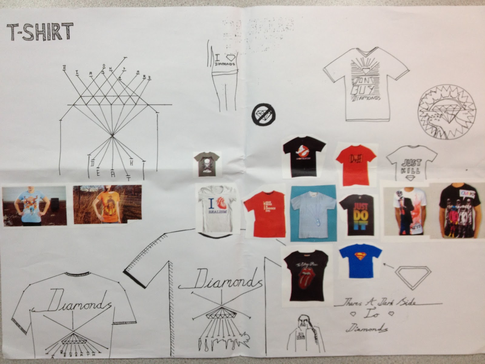
I could also make a t-shirt. I would have to screen print onto fabric to create these intricate designs but the idea is there. I suppose in retrospect there is probably little possibility that people would want to be seen in a t-shirt about blood diamonds so this idea will probably stop here.

Although I might borrow some of the ideas off the front of t-shirts and place them on posters if I still think that the idea is interesting when I get around to it.