Wednesday 29 February 2012

THE TRUTH// Design Sheets

 This time I'm working in a group, our brief to to produce something that will get people to tell the truth more. We have approached this task in quite a laid back way. It will be lead by visuals and will probably be a website where people will 'tweet a truth'. The truths will probably be fairly laid back things because people will be using twitter accounts and will not be anon but we are hoping that we would start a trend with this and hopefully draw people tot he page with some good design.
Today I drew up some design sheets with ideas for logos or page headers.

Notably on this page I have attempted to
-draw a hash-tag with TAT (Tweet A Truth) woven into it.
-Pinocchio, based on the fact he was a famous liar.
-A return (or enter) key. When you post on twitter you hit enter, here you would be hitting 'truth' symbolically.
-A simple circular design, sort of playing on Meet the Parents style circle of trust.
-A 'truth bomb' being dropped from a 'truth bomber'

On this second sheet:
-A twitter bird surfing on a 'truth missile'
-A judges hammer dishing out a truth sound??
-Truth written sideways in an exclamation mark. Sort of like entertainment televisions logo.
-Truth being phonetically shouted out of an old-school megaphone.
-Truth breaking through chains.

All very symbolical of course...

I have also reproduced these in Illustrator for your amusement:


Sunday 26 February 2012

D&AD BRIEF// SPACE RAIN Part 2

I haven't yet decided which of these two final products I prefer. On one hand the scratched version has some character but this could be lost in print. On the other hand the 'clean' version has a certain richness in its vector graphics and would probably be more suited to print, but it doesn't really finish what I set out to do with the whole sci-fi film idea. Still, I like both posters on merit of their content and style. I have also added a drop-shadow to the header in this version. It sort of suits the style, this poster is no place for clean Swiss typography!


D&AD BRIEF// SPACE RAIN Part 1

During the crit I received the most positive feedback for the  Space-themed poster. I'm guessing this is because the concept of looking at rain from an astrological viewpoint is something new to a few people, whereas my other posters were all quite basic in principle and had nothing extra to give.

So in this spirit and with some ideas I picked up from the crit I have produced some space themed posters with the aim to make them look like screens from old sci-fi movie openings.

 First off I experimented with some screen and multiply layers on top of the original poster. The result of this was pretty rubbish. Here I have applied a gradient from red to black, obviously the gradient has not rendered very well leaving a weird grey/ orange in the centre.
Again messing around with no real benefit, this time using a sold red to see what effect this had on the poster. I chose the red theme because it evokes memories of  the first colour sci-fi films about 'the red planet' Mars. It also will hopefully allow this poster to stand out from the others as most are Blue because blue = water.

With this poster I finally recoloured every component. I also added a revises gradient which starts as a brownish colour and fades to an orange red and then to a near pink. This pink part is obscured by the drop/ comet shape.I also fiddled with the text colour, making the header white to jump out at the viewer against the deep read background. I also messed with the body text, changing the text to the dark brown colour and the tab to white. This layout draws a bit too much attention to the bottom right of the poster...

 To rebalance the poster I change the tab colour back to brown and then set the text to white, like before. Most importantly here I have changed what the text says; adding 'and Asteroids'. This is because I have carried out some more in depth research into the theory's of waters arrival in Earth. Although this is still one of many claims, this seems to be Nasa's viewpoint currently. As this is for a lecture I thought I should get the technicalities right. 

Finally here I made a minor change and switched the bars in the top left from brown to white. This cuts diagonally across the page with the header and frames the text nicely I think, but also fills some empty space.

 This is where the poster takes on a Budget Film feel. I spent ages messing around with various different layers, masks and textures to come up with this. Notice I cancelled the dust texture from the front-most droplet and also the top side of the tab. This was to bring the two forward, not really noticeable at a glance but I think it works.

Thursday 23 February 2012

D&AD BRIEF// SPLASH

Final poster for the crit tomorrow; This idea is very simple but as I developed it I added some nice subtle hidden imagery and text which I think brings something extra to the illustration, which in retrospect, would have little good qualities without. I use the phrase 'Rain on" with delivers a simple message very quickly. For some it also evokes the memory of soppy love songs, but I don't know much about that. When I hear the phrase in my head it is said like a west coast surfer.

 I started this poster with a vector of a splash. Although at the end of the day I used this as a guideline I messed about with this for ages trying to get it look more professional, but it will always look like a poor live trace so I chose to paint and pencil over it.

 Here is a transition between the basic outline I drew of the droplet and a solid black stamp of the droplet. I added some extra drops in the centre to give the view some more visual clues as to whats going on. I also realise here that the splash looks like a crown, which could be tied into the British angle of the brief.
 I realised that an upside down image of the British Isles looks like a great reflection in water. Here I also started the very long process of coloring the work, The outline is a light grey and the colouration gets lighter into the image. The colours look very creamy and I think that some of the 'wateriness' could be lost in this...
 Here I tried to add some surface to the splash by adding rings around the base where the water would be. The reflection is coloured by a different method (with pencil tool) which gives it a more shimmering surface aesthetic.


 I tested adding text to the splashes wall. Here I used Clarendon in uppercase to see if the text would fit...
 With the pencil tool I added some shimmering text to the splash based on the font above.

Here I added some more text to the bottom of the poster. I'm not 100% sure this is really needed, But it does tie the poster so a conclusion. Because its hard to see Britain at first I hope this doesn't just confuse the viewer. The poster needs something extra at the moment, maybe I could make the rain look more like a crown or take away the text so the image is dead centre...

Wednesday 22 February 2012

D&AD BRIEF// SPACE RAIN

Today I knocked up some designs for a space themed poster. I wanted to move away for traditional view of rain as 'romantic' and focus on something that would change the way people perceive rain with an amazing fact (I hope).
So I knew that water probably came from asteroids but I needed to do some further research and found out that the space objects stopped hitting earth about 3.8 billion years ago, proceeded directly with the birth of life on our planet, due to the water they brought. Ice comets disintegrated on impact bringing enough water to fill our oceans, although this is one of many reasons why there is water here, other resons include; volcanic activity released steam, water seeped out of hydrates in rocks, etc. None of these other explanations are as romantic or interesting as the space theory and Nasa appeared to back the asteroid/ comet theory too so I went with it. I also thought that the image of a comet flying through space could relate to the image of a rain drop flying towards the ground. I also learnt the difference between a comet and asteriod. A comet has a tail, which is more visually interesting and more suitable because from the research I gathered; comets are made from Ice water.

 First task was to create a drop that had some motion to it, so I used a basic gradient with a single large raindrop illustration. I tried both ways round to see which was more suitable and picked a deep blue starting color which fades to a very light grey.

 Added text to try and make the droplet appear more like a comet, trying to add some double meaning. I also added some diagonal lines to increase the perceived speed of the droplet across the page. The text sort of conjures up the imagery of old sci-fi films from the late 50's, talk of space also does this I think.

 Neatened up the lines and sent them to the back of the image so the droplet/ comet can sit on top. I think the lines here are too overpowering in some respect and sort of ruin the poster, perhaps this is because they link up with the top side of the droplet but not the underside, which sort of throws the composition off.

 Deleted the majority of the stripes, but left them at the top to fill the large blank space up there. I also added some text to a fairly large tab that pulls across the page. Here the tab is far too overpowering and the font does not fit on the page at all. I have also shifted the drop on the page so you can see the tail, it just looks more balanced like this.

 To defeat this issue I added a fold to the tab to bring it forward while also shrinking its size back so it is not so dominant. Also changed the font to Clarendon (of costa) to give it a more factual-but-friendly feel. 
 I destroyed the lines and replaced them with a repeat pattern of more droplets at the same angle. I though this would bring a more even weighting o the poster and also fill a lot of blank space. I id keep two lines to frame the text however. I might still get rid of these because they do not match up with the raindrops. I also added 'according to Nasa' to the copy. This adds some credibility, but also subtly informs the audience that this is one of several explanations.
I like the poster so far, I want to build on it somehow. Maybe add more text of improve the imagery somehow...

Tuesday 21 February 2012

D&AD BRIEF// RAIN ON Part 2


Continuing the rain drop poster and trying to add some depth. Also trying to make it stand out a bit more for the audience.

The first obvious step was to darken the blue raindrops. That's basically all I have done here. Its a very subtle change but I realise that it make a huge impact on how clear the text is and how the negative space sinks back...
To bring the centre of the poser back to the foreground I have added this gradient to the whole poster. I've used this trick a lot recently and I'm not proud of myself.

The poster still needs some text possibly. Although at the same time I think I will go to crit with this and listen to suggestions because It could be that over-complicating this will ruin it.

Monday 20 February 2012

D&AD BRIEF// NO SARCASM!!

A poor idea I had based on something I remember my friend telling me when we were 7.

D&AD Brief// RAIN ON

 For this brief I am creating a series of posters, that do not have to be related, about RAIN. The brief was set by Erik Kessels for some D&AD lecture of his in Manchester.
For this first poster I am keeping things very very simple. The poster is so basic in concept but it was one of my first Ideas and I could not resist making it just to see how it would turn out.

 First stage was to make a pattern, at first I was going to make this a liner repeat pattern but I though this would miss represent the randomness of rain an may also make the poster look too tidy and the text too neat. I thought that like this the text would loose some of its shape and look more like a blur adding some speed to the image.

 I used magenta to colour the text so I could work with it easily on a confusing background, there is no aesthetic reason for the colour. I used Franklin Gothic with a 12 percent sheer as a rough guide to the formation of letters in the rain.

After deleting the text overlay I could fine tune the image to get the raindrops in my desired place. In my opinion Franklin Gothic is still clearly visible as the font which is interesting because of the randomness of the droplets.

 Finally I added some colour to the design. Obviously I chose blue but I will experiment with a few others. The poster looks fairly appropriate but it wont stand out at all at the moment as the rain is not bold and neither is the text. 

Some improvement is needed on this poster. It would work well in a very specific context, for example in the lecture but I still think it might need more content. perhaps a little tagline or a small tab coming across the page. This will all need further consideration...

Wednesday 8 February 2012

OUGD 405 Self Evaluation


1.  What skills have you developed through this module and how effectively do you think you have applied them?

I have an increased knowledge of Photoshop and illustrator, which I used for all of the design briefs in this module. I have also applied some of the techniques and theory’s we have been taught in other modules to this one, for example which layout is correct as well as some colour theory and the correct use of type.
In most cases I have applied the skills I have learnt as best I can. In some mock up pieces I used tools in illustrator for example to get work done very quickly and when I went to finish I worked into the designs until they were much more desirable. This is evident in the posters for the 100 things brief, were the posters all started looking very messy and gradually progressed.


2. What approaches to/methods of design production have you developed and how have they informed your design development process?

In this module, especially on the 100 things brief I carried out huge amount of research that meant that when I went to design the work I full understood what I was saying. I found that I could write body copy on the subject fluently and did not need to double check facts online. I felt that I fully understood the topic, although it is not black and white and there is no conclusion.
I also developed more on the system of designing in illustrator. For the products I made were mostly text based with vector graphics images. The How To brief really tested my ability to produce work quickly and work as a team which is a skill I definitely think I have improved on since the start of the year even.


3. What strengths can you identify in your work and how have/will you capitalise on these?

I think I have become less afraid to produce more experimental work and not follow a pre-existing style as closely as I used to. In the future I would love to break free from conventional design for a module, although saying that I love design that follows the rules too.
I also think I have worked out some good colour theory, in most products I would like to think that the colours are all suitable for each other and none of them clash. This is a skill I could develop further however, I feel that although I know what colours wont go together, I don’t yet fully understand which colours do. 


4. What weaknesses can you identify in your work and how will you address these in the future?

Weaknesses I have is that I feel slightly like I have become obsessed with illustrator and have become tied to its limitations. For the next module I would like to leave Illustrator for some experimental work in a different medium.
I also think I made some design errors on one of two of my designs, for example the Dark side to Diamonds poster, which has a terrible drop-shadow effect on it. There is a message here that the effects in illustrator are to be avoided at all costs.
I also started using high resolution images in illustrator, which was a huge mistake because it crashed the program on Macs, even my Pc struggled a bit. In the future I need to edit the images in photoshop and rasterise them until they are a low enough resolution that they will not crash illustrator.


5. Identify five things that you will do differently next time and what do you expect to gain from doing these?

1)    Create some design sheets and sketch more designs, I except that this will allow me to explore more ideas. In a way at the moment, I experiment in illustrator, but of course the limitations here are huge.
2)    I need to document the design process more clearly, at the moment I tend to design things in illustrator and neglect any form of documentation because I feel that if I stop designing I will fall off the horse. I expect this will allow me to get better grades.
3)    I should listen to good criticism early on and change my designs. I Did change my designs because of suggestions this time but after I printed  and ran out of other opportunities to print people still pointed things out to me they would like changed, in the future I should print things cheaply and ask for help during the designing instead of after the final prints. This would obviously allow me to change my designs while I still have a chance.
4)    I should manage my time better. In this project I found that although the designs were all spaced out I did somehow end up blogging at about midnight or in the early hours of the morning. This is because dinner, washing, socialising with the people I live with can fill a gap between getting home and working on projects. I desperately need to find a good balance and stop cooking meals that dig into work time I guess. This should give me more time to document the days work and generally be a better designer.
5)    I need to learn how to prepare designs for print better. I went several times to print out stuff for this module and although most of the settings were ok, because I had lots of double sided, things got a bit confusing and the alignment was rarely correct. There are lots of reasons for this, mainly my set up, then I found out that paper from the library is cut to the wrong dimensions. In the future I could go and talk to James about prints and then go and buy the paper and set up the files. This would allow the print process to go smoother and take up less time.


6.How would you grade yourself on the following areas:
(please indicate using an ‘x’) 

5= excellent, 4 = very good, 3 = good, 2 = average, 1 = poor

1
2
3
4
5
Attendance


x
Punctuality


x
Motivation


x

Commitment


x


Quantity of work produced


x


Quality of work produced


x


Contribution to the group


x

Tuesday 7 February 2012

100 Things// Printed Flyers

 I finally got all of my flyers printed out properly, just in time for module submission tomorrow! I printed all 5 of them on the same stock: Antique White. After some initial confusion with the layout of the designs on the screen the final products matched up pretty well. The stock gave a nice finish although it does tend to bleed a bit, but that was expected.
 
The front side of the De Beers flyer. There was some cropping issue at the top of this flyer. This is because the alignment was all out due to the librarys paper being cut too small.

This side of the flyer came out much better than expected also, I thought that some of the fading towards the edges would not be reproducible on the printers but it ended up working really well.

This came out very similar to the poster, however its on a different stock so is a good example of what the poster would have looked like on antique white.

This side of the flyer is probably my favourite product, in terms of the information, layout and colours used. What I have realised now that I didn't before was how bold the black numbers at the bottom are in comparison to the rest of the flyer. Perhaps if i has some at the top of the flayer to even it out it would have been a good idea.

This flyer is looking pretty minimal compared to the other products. Its slightly less packed on this side but I hope it will speak to the type of audience that will take the time to read the text on the back...
This side just looks like a page from a book. There is not really much to comment on in terms of the design other than the text printed very clear and the whole design is slightly off centre because of print issues.

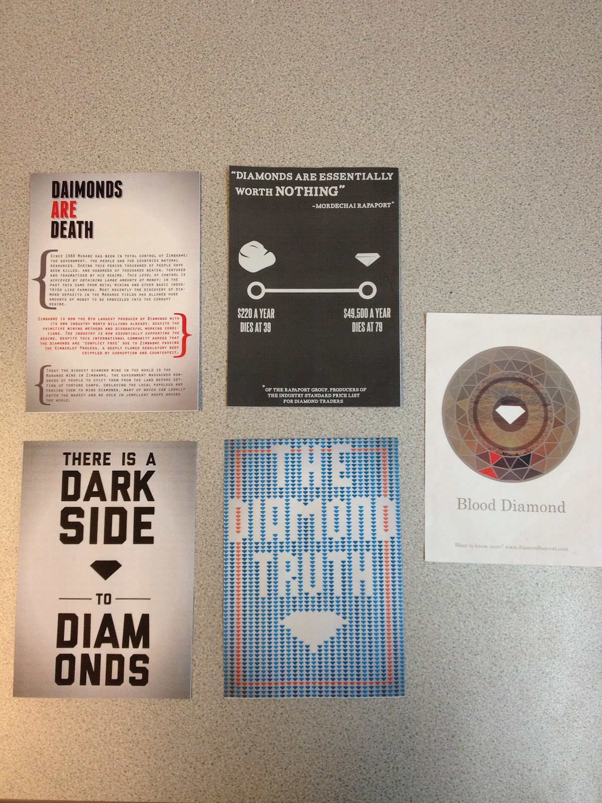
I had high hopes for this design but it did not really come together as I had planned in the end.There is a hell of a lot of text and I can understand why some people said that they did not know where to start of look. This is an issue that I had again and again when designing the flyers; so much information and so little space.

The other side of the flyer came out a little better but im still not entirely happy with the overall result, something I cannot quite pinpoint, but I think it has sometyhing to do with the way that the colours sit on the page, or the very large kern on the type at the bottom?


Again the front of this flyer is very similar to the poster, printed on the same stock too. I think it works ok but now its printed I look at it and feel that more space needs to be filled.

The back of this flyer suffered from alignment issues, this is most noticeable on the right where a bracket for the 'Find Diamonds' text is cut off. It is lucky that I added a huge bleed area for this side of the flyer or lots of white paper would be visible on the left hand side.


Overall the flyers came out pretty good, they all have a good suitable stock and have printed fairly well. There were some issues with alignment but none major. If I was going to shange something i would have added more bleed to all of the flyers and also probably seen if I could have made them a bit smaller.

100 Things// Flyer Print Layout


I found out some interesting things today when trying to work out how my five double-sided flyers could fit onto one sheet of A3. I stared off by very carefully arranging my designs over two art boards in one illustrator file:

So i spent maybe an hour making sure that the layout here was perfect but apparently this would not have worked on the big printers so when I went to print I have to switch things around by using two separate art boards and two illustrator files, three flyers on one and two on the other.

Monday 6 February 2012

100 Things// Flyer Mockups

Here are some quick mock-ups for my flyers that will accompany the posters when I print them out properly tomorrow. Everything seems to be good but some of the fonts are missing on the college computers so I need to change that urgently this evening!

Front

Back