Friday, 3 February 2012
100 Things// Dark Side to Diamonds Flyer
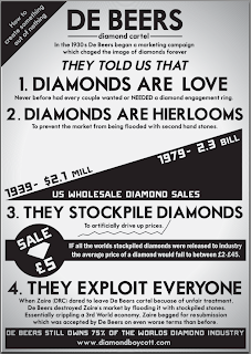
I set out to make this poster a little different to the others. It is quite factual, but once again these have to be short and clear because of the flyer format. The big difference with this flyer is its subject matter, which shifts from accounts of maltreatment in sub-Saharan Africa and focuses on attacking a large corporation directly, De Beers, Also known as 'The Cartel'.
This flyer is linked to the 'There is a Dark Side to Diamonds' Poster, I decided to part from the white on dark type of the poster and revered it to black on white, retaining the posters style but making it more suitable for the given size.
The front has the same type as the poster but with a more refined look, I have taken away the joining lines and background image to create something small which really stands out. The same fade effect is used here as a background in the hope that it adds some tonal changes that are needed because of lack of colour. I didn't want to add any colour to this flyer firstly because I don't feel that it needs any colour but also because I think adding colour could make it confusing. The same diamonf shape also reappears to tie all of the products together.
The rear of the flyer basically documents how De Beers managed to build a diamond monopoly. It is information about good advertisement and poor ethics, a dangerous combination, but one that has worked very well for them... and not so good for everybody else. The style is simple but effective and I hope for readers to read from top to bottom following the numbered points. There are one or two points that are intended to draw the reader into the text, like the £5 diamond sale, after reading this fact who would not want to learn more??
The difficultly I had creating this laid in the font I chose, Motor Oil 37. As my text started the story off in the 30's I felt this was a fitting choice however the font does not contain any glyphs, which turned out to be a huge pain.
Other than that everything wet pretty smoothly, I had all the facts prepared so shoving them onto a5 was easy in a way. The only problem I think this has is that there may just bee too much for a reader. People may pick this up and be thoroughly turned-off by the lack of blank space, it is pretty crammed but there is some interesting text also...
I didn't want to add colour but I tried out different tones of Key in illustrator as well as with and without the background:
I don't like the solid black design because it looks too much like a newspaper ad and all the light grey versions do not stand out enough.
Labels:
100 Things,
OUGD 405
Subscribe to:
Post Comments (Atom)


No comments:
Post a Comment