What skills do you think you have developed through this module and how effectively do you think you have applied them?
I have continued to improve my design, and production skills throughout this module, however I do feel that I am not totally satisfied with the way I have managed myself during this module. The most important things I have learnt from this module has been the application of theoretical ideas in my design, actually fabricating a final product in a refined way. I have also improved the way I photograph and document finished work, which is still not perfect but an improvement on previous modules.
What approaches to methods of design production have you developed and how have they informed your design development process?
On this module the first step of design production came from a contextual and theoretical understanding of my subject. In fact I became very involved in the subject, so much so that I lost vast amount of time to researching the subject, reading on for far too long into tangents that I never needed to research in the first place. This impacted on the way I produced the final product, as I had a great general knowledge on the UK and US space industries, however comparatively little time to complete the work I wanted to produce. Even during design focused sessions I would find myself watching an hour long documentary on youtube about the development of Saturn 5 for example, a big waste of time, but very interesting. As a result of researching a good number of visual identity manuals I really did understand exactly what I needed to make a successful one myself, this was another example of how the prolonged research sessions probably sped up the design process a great deal, eliminating any worries I had about starting the large publication.
What strengths can you identify in your work and how have/will you capitalise on these?
The main thing I have enjoyed about this particular module has been the ability to choose a subject I am really interested in and really produce some work that means something to me. I have also greatly enjoyed researching the new subject expanding my knowledge. At the same time I have avoided going down route 1 and just making a publication about space, rather I have contextualised my interest in space exploration into a working redesign. I think my strengths in this subject have been in realising a good concept and making it work.
What Weaknesses can you Identify in your work?
My weakness in this module was a lack of discipline when it came to getting carried away with research, spending too long reading and watching videos about space, even when I was suppose to be designing. This really cut into my design time and my ability to follow the set session structure where I found myself very behind. I think I managed to rectify a few of these problems by powering through at the end but at the same time I could have always done more If I had focused on the task at hand and followed my schedule. Both in the designs themselves and the response and evaluation of them.
Identify five things that you will do differently next time and what do you expect to gain from doing these?
- Follow my plan to the letter. I had a really detailed schedule that took me a full day to draw up, documenting exactly what I was suppose to do and when. I found it very difficult to stick too, even though it was designed to be possible. I just need to develop the discipline to work through a studio day, come home and continue instead of just logging out as soon as I leave college.
- I would have liked to have started the publication over Easter instead of when we got back. The most important thing that I need to improve is time management and the ability to say no to things that will take my eye off the ball.
- Blog studio sessions and the discussions we have had in them. Basically I would like to bring my laptop to these sessions in the future and blog about them then and there so the notes I make aren't lost and the ideas I generate in these sessions are not lost with them.
- I would like to expand my knowledge of other designers and bring their work into design practice more. I can gather a lot of other examples of work and ideas that are floating around out there from a range of sources and interests of mine however I find it hard to find many designers that I can talk about in any great detail. I think this will improve the way I think about the design industry in general and give me a more contextual grounding in design itself.

Tuesday 21 May 2013
Monday 20 May 2013
WHAT IS GOOD// Final Photos of Identity Guide and Public Info Booklet with Evaluations
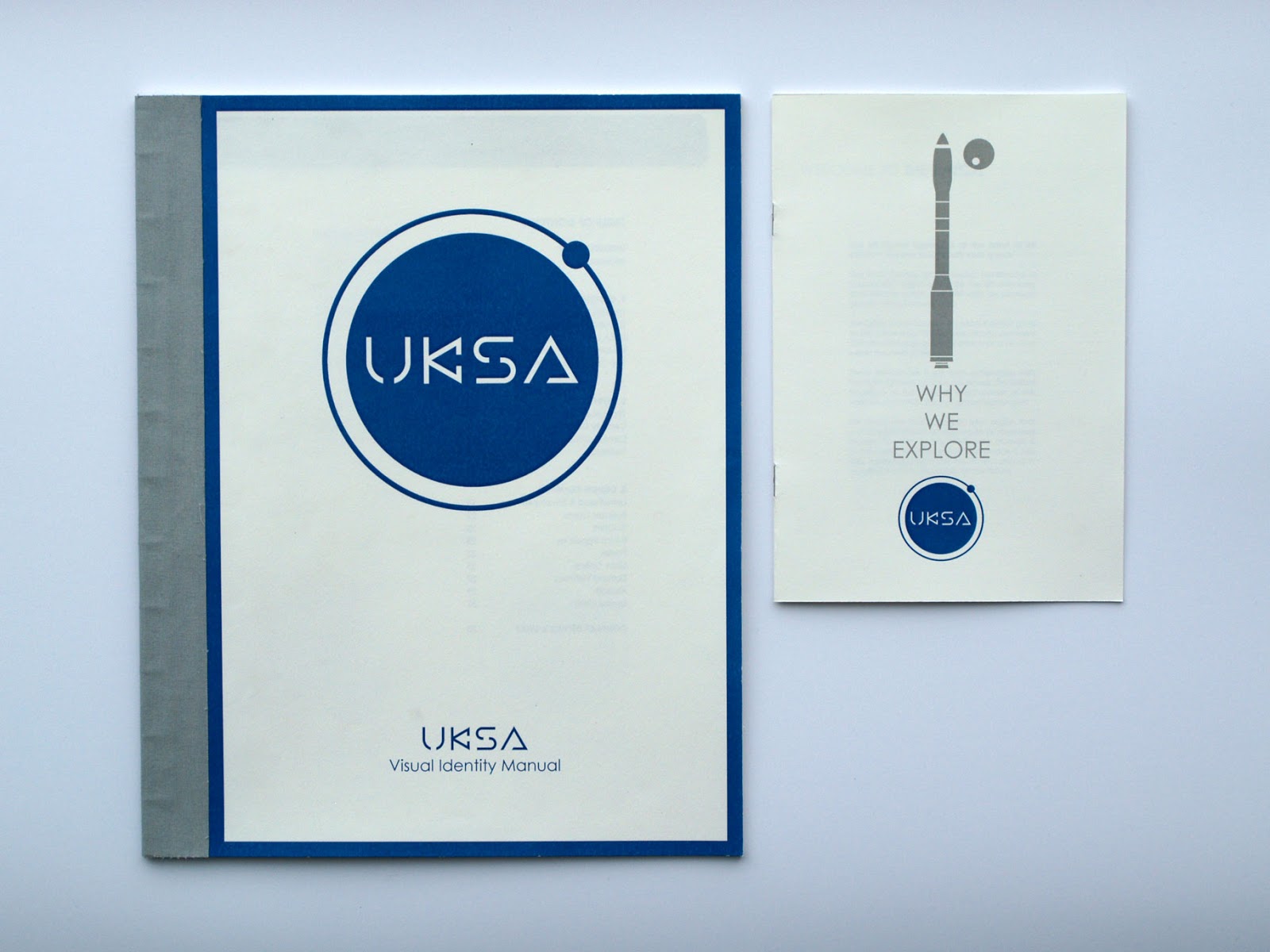
The UKSA Visual Identity Manual.
This is the centrepiece of this module for me, it is the combination of a whole lot of research and critical understanding of a subject that I found it hard to wrap my head around. Although I found it fairly smooth to design in the end I feel this was directly down to the good amount of research I completed before I started. From having a very basic knowledge of the space industry, and virtually no knowledge of the UK space industry I can now talk about it quite fluently and I think this manual is a testament to that. I am also really happy with the visual intelligence of the logo itself, it subtly nods towards the professional slickness of the NASA worm logo, without being a copy and the text sits within two circles which represent a basic principle of physics in space; the way smaller bodies with a lower mass orbit larger bodies. Firstly this represents a planet or sun with an orbiting body, [ Earth and the Moon] [The sun and Earth] [Jupiter and titian] it doesnt really matter. The second thing that the logo represents is how the UKSA is a governing body, that helps and matures smaller organisations and startups, it is the large group in the middle supporting the new idea, or the entrepreneurial startup.
The content of the manual explores the rules of the identity re-brand, the application of typefaces and their fonts and finishes with a wide range of examples of the identity applied to a range of contexts. This means that the manual could be used by anyone; from an employee smashing out a small office poster to a design studio building the new website, anyone could read this manual and get a feel or solid instruction in how the identity works in real life. It explores a more mature and a more inspiring version of the UKSA than what is currently out there and I really do believe that if the organisation used this identity it would be viewed as less of a government project and as more of a proper, scientific organisation, which is what it deserves. The aim of this project was to rebrand the UKSA so that the public would view it in a better light, for the reasons stated above I believe the project has been successful.


The Booklets as a Set
When I designed the second booklet it was obvious that I had to follow the rules I had just made in the visual identity manual. This was a great opportunity to use the rules and apply them to a real world product to see how they work out. This also produced a booklet that works with the manual as a set, and it explores a move that I think the UKSA should take; a serious redesign, with an empasis on informing the public about the advantages of space exploration. With public suport, there would be less backlash against government funding of the space program and hopeful more applications will get through so we can see real innovation.


The Public Information Booklet: Why We Explore.
The purpose of Why We Explore is twofold. Firstly it was designed to prove that the rules in the visual identity manual work in a real life context. Secondly it was to explore if it is possible for the UKSA to get more of the public on side when it comes to spending money on space exploration. The publication remains short because it is designed to be distributed into a busy public domain, where people don't have to much time to read a long winded document, at the same time it is full of facts and figures explaining why we should invest more in space exploration and how health it is for our economy and our future. Key features are presented in easy to read graphs whilst reading the body copy will take longer but be more convincing. I considered stitching the pages for binding but settled for the simple stable binding on the spine because I thought that that was how the booklet would appear in public, it is a quick read, throw away item, that would be cheap for the UKSA to produce so I thought that this would be more suitable. Again I was pleased to have done all the research for this document in advance, and I think it reconfirms that I have really gained an understanding into my subject, I have even written I bit about the SKYLON project in the back as en example of an inspirational role of the UKSA and the future of space travel. I included this story because it demonstrates a really exciting prospect of the future of space travel, the first spaceplane that operates like something out of star trek. I the booklets have been generally successful in fulfilling their purpose. If I had more time it would have been great to generate a range of them.


WHAT IS GOOD// Final Photos of Research Book and Evaluation
The research book is a document that details the things that I found most interesting and relevant to my project at the start of the project. Obviously the content and the research changed over time but this is a general overview of what I had been looking at and what got me interested in the first place. My 'what is good?' was space exploration so this booklet explores the fundamentals of space exploration in Europe and the UK and goes on to look at exciting new developments finishing with my plan for the publications and some examples of other work. The cover is very simple and follows a design aesthetic that I have been developing to label any project related support work that I produce, to see what I mean by this have a look at my responsive manual. Its a good way to mark up non-design research and analysis work, whilst separating it from the actual design practice segment so the two dont get confused. I printed the research book on a thick cartridge sock which gave a very unusual textured finish on the laser printer, then stitch binded the spine, creating a booklet. The booklet is fairly comprehensive also and covers a wide range of interesting topics. I did actually use the information written here in my briefs and I understand that at some times this book is quite dry in its tone, but it covers a lot of topics in a very small space, hugely informative for the understanding and production of the design end of this brief. The booklet also features large photos on each dps which are related to the text opposite, this uniform design layout works at making the book readable, but it also works as a great picture book with some really interesting content.


THE WALL// Final Poster Image and Evaluation

The Wall
The wall was an interesting and very short brief for me as I turned this around in one afternoon and morning. I was fairly surprised that it was so well received because of this, saying that it was great that people liked it. Personally its charm has mostly worn off on me how, I do like the concept and the final product, but I dont really know what to think of it now. In a way I feel that although it looks cool the first time you see it I wish I had spent a bit more time developing the idea so that it works like that every time you look at it. I know that if I had given this a bit more consideration it could have been better. Also to get all the text and shapes to work like that was very technically challenging, really really hard to understand and design, I wish that this was more evident in the design because it looks like I've just stuck coloured card down behind the front sheet rather than designing the maze that is actually back there. One thing I really do like is the stencil version of Edmondsans that I had to create to make sure counters weren't punched out by the lasercutter, it looks pretty space age, perhaps something I could have used in the UKSA brief.
WHAT IS GOOD?// Binding UKSA Identity Manual
In the morning I have printed and organised the UKSA Brand Identity Manual. The manual was printed on bulky newsprint because this produces a nice, semi-coated feel if its put through the laser-printer. I am slightly disappointed by the printers reproduction of the black colours however the blue identity colour is pretty spot on. Another advantage of using the laser printer is that it produces superior duplex prints over the digital room due to it being automated, and the text is much finer and does not bleed at all, even on this fibrous stock.
 In this image I have securely clamped down the loose pages and have started drilling 11 holes down the spine in preparation for a japanese bind. The danger here is that if a single page shifts it will basically be ruined and I will have to print it again, which is not really an option given the time contraints. It is remarkably easy for the book to shift at this larger size which is why I went a bit crazy with the clamps. This image also shows how I have trimmed a bout an inch off the spine side of the book. the other three sides will be trimmed after the pages have been bound.
 I japanese bound the book using the waxy black thread, I chose this because it is much stronger than the white and will be hidden by a cover anyway. I am binding this book with the same technique I used for the Fedrigoni book in the responsive brief however I have managed to make a much stronger bind here, which I guess shows I've got better at binding since then. This type of bind is suitable for the weight and size of this book, I almost perfect bound however this book is too skinny and tall for this to have been truly necessary. The japanese bind is stronger but has left me with quite a wide area for the binding alone, plus a bit extra so the content is not lost in the binding area. I took a bit of a gamble here that the area used for binding was not to thin that the book would fall apart but not too thick that the binding area would be much to wide and eat up the content on the inside fold. I managed to get this just about right with carful planning and a bit of luck.
 I have used a small amount of double sided sticky tape to secure the binding cover in place and applied a good amount of pva to the spine to secure the binding. This should make the spine very durable. I then stretched the binding cover material over the spine and around the other side. The material I have used here is designed to cover card to create hardback book covers, I've sort of used it as binding tape for this book and I think its has been pretty effective visually and structurally. It took me a while to measure everything up and cut the material to the right size before applying it but I managed to get it spot on, which is lucky as trimming afterwards would have been impossible.
 Rather than use the big book cutter that is apparently getting rather inaccurate I decided to trim the other sides of the book with a big craft knife and ruler. This was nerve-racking to say the least but the end result is a much cleaner and even cut. One thing that would have been impossible on the big cutter would be getting the weight of the blue boarder lines the exact same width on all four sides, as well as making sure that they are completely straight. With the craft knife a ruler this aspect has been much more accurate.
 Im really pleased with how good the book looks now. If you compare it to the test book I put together to test the size and layout its a huge improvement, any quality that the laser printer subtracted from the overal look and feel is reimbursed by the quality of the paper and the binding. What I am also very happy about is that I managed to find an off-cut of the exact material that I wanted to cover the binding; its great because it matches the 60% K colour which is one of the visual identity colours outlined within the book itself.


Saturday 18 May 2013
Friday 17 May 2013
Thursday 16 May 2013
WHAT IS GOOD?// Indesign Public Information Manual
The aim of the Public Information manual is to:
1. Provide an example of how the brand guidelines will work in practice.
2. Provide the UKSA with a public facing booklet which argues in favour of the space exploration industry.
 I've started the production of this booklet with a fairly standard 6x8 grid, which can be used to make 2 or three columns of text and has a good number of options for the placement of images. However becuase of the small size of the booklet I will probably use the central area in as a single column.
 I could apply the front cover for this booklet, I created this in Illustrator earlier and have used this grid here to position it dead centre. The aim of the cover is to appear modernist and refined. The name 'Why We Explore' is inspired by a section from NASAs website, it adresses the problem of people who disapprove of space exploration without sounding too superior.
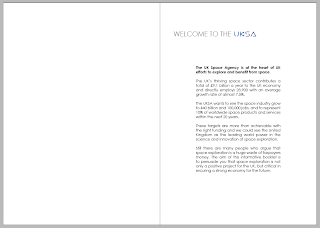 The first page explains to the public what the UKSA. The information of this page came from their own website, I've tried to tailor the message in a more positive way. Looking at the benefits of the space industry and where UKSA sees itself in the future. I didn't include a contents page because the booklet is short and it would be a confusing waste of space.
 The second section focuses on the benefits of space exploration and how it has already directly shaped the world we live in today. I wanted to fit this section into as small a space as possible. This has lead to the page being a bit text heavy, and I did want to add some illustrations, however the addition of illustrations now would make the page far too busy. What I have done it try to fit a large amount of information into one A4 dps. This is the first persuasive argument and by realising the things that space exploration has already done I hope people will be persuaded to have the imagination to see where it could take us in the future.
 This is the same content but without the grid markers, showing how the text fits on the page. I have left a large boarded around the text because of the small size of the booklet, I am weary that any content that strays too far to the edge will be covered by the readers hands when reading.
 This dps looks at how much it costs to run the UKSA and how much the uk space program gives back to the economy. It explains the growth of the sector as well as the comparatively tiny amount of money the UKSA takes out of the public purse in comparison to other expenditures. A little feature I like about the design of this page is the 'moon rise' illustration behind the circular chart.
 The next section is all about employment and manufacturing One argument is that the government could be spending the money that the UKSA gets on providing jobs and helping deprived areas. This page argues that money put into growing the uk space sector will provide jobs and a growth in high tech industry and manufacturing. This includes a much steeper graph showing just how fast employment in this sector could rise given the right funding. I have also added the illustration of the three different workers to make the information and text seem more approachable
 The final pages focus on painting an image of a bright future of the UK space industry and to also provide an example of the role of the UKSA. These pages look at the SKYLON project, how the UKSA administrates the funding and helps with management for REL (Reaction Engines Limited) who are building the space plane. The layout here is simple with the imagery reflecting the space used by the text opposite.
 The back page of this smaller booklet is blank appart for the adress to the UKSA website. I find it strange how they are forced to use the bis.gov stuff, it makes the agency seem rather bureaucratically linked to the government and maybe they are, but if the industry wants to be competitive and attractive for investors they need to break that image and I hope this booklet goes some way to do that.
1. Provide an example of how the brand guidelines will work in practice.
2. Provide the UKSA with a public facing booklet which argues in favour of the space exploration industry.


WHAT IS GOOD?// Image Generation for Public Info Booklet
I've been piecing together a few bits of imagery for my public information booklet. This second booklet will inform the public of the benefits of space exploration to us as a civilisation and also to the UK high tech and manufacturing industry.
 This first illustration features three 'workers' which could be considered as analogues of real world workers finding jobs in the space exploration industry. Left there is a mathematician, middle a character representing someone with a construction job and on the right an engineer. They will fit onto a page about the job prospects that the space industry has to offer.
 I used this graph from a site about the UKs government spending to create my own version for the booklet. I basically just copied the whole thing and changed the colours. The aim for this graph is to explain the tiny amount that the UKSA takes out of the overal budget, such a little amount that the graph doesn't even need to change shape or values.
 I converted the graph into this sightly more stylised version of a pie chart. I thought the standard one would be too plain, or average, not sending the right sort of message that I want the book to send. I have also added this moonrise behind the graph, suggesting that the two circular shapes are planets in orbit.
 I switched back to using just one colour for the graph. I realised that the use of multiple colours was unnecessary and broke the visual identity guidelines. This colour blue is the C100 M70 Y0 K0 that the guidelines suggests using. The grey is also the K60 from the guidelines. This refines sort of thing refines the booklet and brings it in line with the guidelines, but also improves it aesthetically.
 The other thing that I have put together here is some ideas for a front cover of the booklet. The visual identity manual has already provided me with some rules and regulations as well as all the components I need to design this cover I just needed to arrange these in a way I thought looked good. The rocket is an ESA Vega, a small satellite launcher that the europeans use put things in orbit. It is taken from the manual design application page. The typeface I used is also one that follows the manual regulations, Century Gothic regular.
 Because the manual has given me a set of rules and imaged all I really need to do is arrange the components successfully. Here the UKSA Orbit logo sits on top of the Vega rocket, this would be breaking one of the rules from the manual, that the logo needs a 1:5 width boarder around itself comparative to its size.
 This too would be breaking the same rule and the heavy italics are too over the top for the professional tone that I want the UKSA to set.
 Positioning the text in a suitable location is also important, the title needs to be seen before the logo so It makes sense to place it above the logo and at a larger side to improve the overal hierarchy of the cover. Here I have also tested a planet, I want the rocket to look like more than just a solitary placeholder. The planet or moons aim is to provide a destination or target for the rocket, and to also give the image some perspective.
 This is the final cover which I will transfer to the indesign document soon. As you can see I have repositioned the elements so that they follow the rules of my UKSA visual identity manual, the logo has got some space around it and the font and location of the title are suitable. I have also changed the spacecrafts destination planet/ moon slightly and placed it in new location, which subtly reflects the location of the orbiting body on the UKSA logo.


Wednesday 15 May 2013
WHAT IS GOOD?// Indesign UKSA Visual Identity Manual Walkthrough
The aim of the visual identity manual is to explore a large range of applications for the new UKSA rebrand as well as to set some rules as to how the whole organisation should be branded and how this imagery should be used within a range of contexts. The manual will allow me to write my own ideas into how the UKSA should run its public facing image and give me an opportunity to explore a stricter, more refined form of graphic design, where function comes before form. The manual will have to be clear and precise, something which anybody dealing with the identity of the UKSA could pick up and read for instant help. The manual has three chapters:
1. Design Elements- Introducing the branding and rules about how to use it.
2. Typeface- For info on the rules of allowed typefaces and their fonts.
3. Design Examples- For examples of the branding in context so readers can fully understand the application of the branding in the real world.
 As with starting any of these books I have set up a grid which I believe will give me just enough options to fit a range of imagery and text onto a page without giving me too many options that could lead to the design and layout becoming messy. The grid is 6x7 allowing for three columns of text and imagery per page or two columns of slightly wider content. I also plan on keeping the outermost sections of the grid clear so that the content is centralised, however allowing for extra room for larger images of longer blocks of text.
 So here is some content in action. I have also added a bar to the top of the page, this will mark the UKSA branding on every page as well as a space for page numbers, section titles and the manuals title. This image shows the contents page and the introduction page. I placed the contents first for easy reference for the reader, It will be very simple to find if it is on the reverse of the cover page. The introduction is short and simple, basically outlining that the book is for reference to help designers and employees work with the new UKSA brand.
 The second DPS introduces the new UKSA Orbit logo for the first time. I named the logo the 'Orbit Logo' because it depicts two celestial bodies in orbit. This DPS covers the different colours the logo can be presented in as well as the outline for embossing and rules for the use of boarders around the logo. The second page explains the colours that make the logo with reference to CMYK and Pantone for spot colouring or digital printing.
 These pages introduce the UKSA text logo for the first time. The content is a reflection of the last DPS but with the UKSA Text logo instead. The two logos are presented on different pages to clarify that they are to be used in different contexts, also that the Text logo is to be used as the secondary logo to the orbit, or in locations that would suit the text version more effectively, like the side of a tall rocket, where it could run up the side.
 This is followed by these rules in more detail, that the Orbit is the #1 logo and Text #2 but can be used and ever turned on its side for special applications. The second page on this DPS sets a few rules out by giving examples of how people using the branding should not use the logos. This covers obvious things like not being allowed to change the colour to not using the two different logo too close together in the same design space.
 Pages 9 and 10 feature the official visual identity colours for the brand. A few of these have already been introduced in on previous pages but give more detail here, as well as adding the shades of grey that the UKSA can use. I also included the NCS and RAL colours where they were applicable here for use in interior or industrial design. The page confirms that if in doubt, use the pantone values.
 Pages 11 and 12 round up the chapter with information about the construction of the Logos and a few more rules about what users can and can't do to edit or alter them. It is also an opportunity for the manual to display the logos independent of other overlay information or illustration so the reader can view them in full, at a larger scale.
 Pages 13 and 14 introduce the second chapter in the book, Typeface. This basically lists the typefaces that the UKSA can use and gives some rules for their appropriate application to design. The pages here list off these rules and explain what roles the various typefaces can have under the new brand guidelines.

 The next two DPSs just display these typefaces and their different fonts with the full alphabet and a range of glyphs and special characters. The main two typefaces are Century Gothic and Century Schoolbook, this gives a good range of serif and sans serif for designers to use. The third font is the web-safe and widely available Veranda which is to be only used by the UKSA online.
 The third and final chapter starts on pages 19 and 20 with information about the brands usage on letterheads envelopes and parcel stickers. These examples follow the rules set out in the first two chapters and will act and guidelines to any UKSA employee wanting to write a letter, or send a parcel. This whole section also acts as an opportunity for me to prove that the branding works on a huge range of products and in a large number of contexts.
 Page 19 details a UKSA business card layout and design with examples of the information that they could carry and details of the usage of both of the logos on either side, an example of their hierarchy. Page 20 shows the branded UKSA id card designed for all UKSA employees. The ID card contains a range of information about the employee with room for various codes and electronic chips which could be used to access certain areas of a building or sign in of out/ log work.
 Page 23 explains how emails should be set up and used and how the UKSA signature should be placed. Page 24 gives an idea for the design and layout of a UKSA poster. This isn't an amazing art piece, the aim is that many non-designers will be using the logo and branding to create quick posters and will be probably putting them up in semi-public locations. These posters dont need to look great but they still need to follow the UKSA design protocol. So this example has to reflect that, simple design aesthetic that respects the fact that a lot of the people using this manual will not know how to design a great looking poster.
 The next DPS on pages 25 and 26 give examples of how the website should be laid out, firstly on a image and text based page and then on a text based page. The aim of this would be for designer or coders to see this and understand how the new website should be built. It is also for the average user who may be updating or maintaining the website to understand the basic principles of the brands online aesthetic. The website obviously also uses Veranda, following the rules laid out in the Design Elements and Typeface chapter, as do all the other examples in this Design Examples chapter. The web design is much simplified over the current version which is a horrible mix of childish colours and mix-matched content. I have however kept the page titles.
 The next few pages in this chapter detail the usage of the UKSA branding in a range of 3D spaces, primarily vehicles. Pages 27 and 28 show the Text and Orbit logos on 'Land vehicles', cars and vans. These would be vehicles that are used as company cars or for transport both on and off site so the identity of the UKSA must be clear, but also fit the design of the vehicles that they are placed on. For example the car uses the text based logo because of its lower profile, which would not allow for the large circular Orbit logo. The van however has a much larger sidewall so the Orbit logo can fit with space whereas the text logo would look to large if stretched to fit.
 Pages 29 and 30 cover the application of the branding to various types of aircraft. This is not just the logo but also some livery features like the identity blue undercarriage and tail stripes. These aircraft are large examples of each category but they give examples of how the identity can transfer onto a very wide range of real world contexts.
 Finally on pages 31 and 32 the manual explains how the UKSA visual identity fits on to two different types of spacecraft, firstly the standard launch vehicle upright rocket and secondly onto the REL SKYLON spaceplane that I have got very excited about. This demonstrates the manuals forward looking outlook as a positive reflection on space exploration, experimentation and travel. Here to I have added a few examples of spacecraft livery as well to fit and compliment the logos and UKSA identity.
 The final DPS in the booklet provides the UKSA contact details that are referred to throughout the booklet. These range from general inquiry to specific people to contact for specific questions.
1. Design Elements- Introducing the branding and rules about how to use it.
2. Typeface- For info on the rules of allowed typefaces and their fonts.
3. Design Examples- For examples of the branding in context so readers can fully understand the application of the branding in the real world.


Subscribe to:
Posts (Atom)