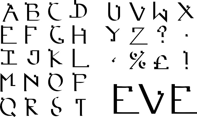
When I doubled the typeface up in Part 2 I sort of 'blew up' the letters with all component parts of them separated by white spaces. As an experiment I stuck all of the black components back together to see what would happen and I kind of like the result. It may not describe Eve as well at first, however the journey of the typeface to reach this particular conclusion does. The Typeface also appears less bold and confrontational, it is slightly awkward or clumsy, which was one of the main descriptive words. It also looks slightly futuristic/ modern and also has retained some serifs to suggest the traditional values. Rounded edges appear to be more soft and caring to look at also. Even if this is not the final design it has ticked all the boxes to describe the 5 fundamental traits of Eve that we decided during the early stages of the brief.


No comments:
Post a Comment