In addition to the poster Ollie asked if I could put together a manifesto for him. He provided the text and I changed parts of it so it could be presented in a more friendly fashion, in that I cut out any repetition or unnecessary statements. I then but it in this easy to read format, with everything clearly labelled and a clear typeface beneath. The big problem for a lot of other posters in these campaigns is that the people putting them together tend to over-cook there design and add lots of 'special effects' like word art to them. Here I think I've toned that back a bit but also provided a splash of colour and decoration, in the blue titles and page breaks. I have also made sure that if you cant be bothered to stop and read the manifesto the title points are huge and easily visible.


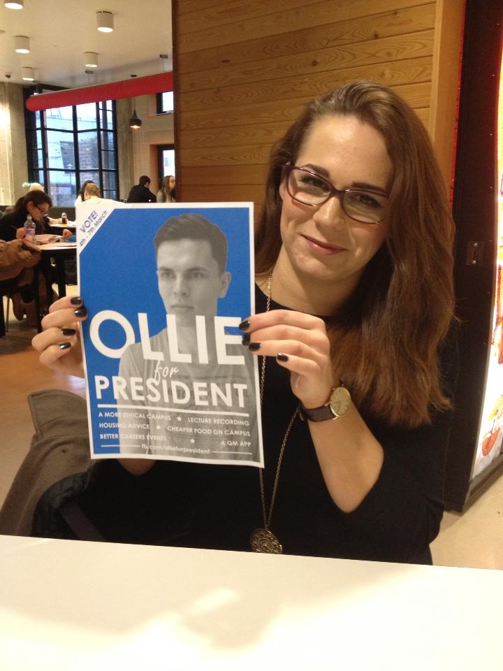
On another point Ollie has posted a few pictures of people holding his posters up around his university. Good to contextualise my design sometimes. I'm not too happy with the quality of the print or colour preproduction though.


No comments:
Post a Comment