One of the most noticable changes for this newer edition for the book is the new underline style for title pages and contents pages. This will allow me to keep the aesthetic and layout of the book while separating the contents pages from the rest of the book for reader clarity. I chose this unusual style because the book needed some brightening up, especially the contents pages. The gradient covers CMY, the inclusion of black was considered but put to bed because it created this muddy effect.
This welcome page and the contents page qualifies for the underline for example.
The standard page however will not feature one.
My contents pages have all been tidied up too, hopefully they look much more professional and easy to read.
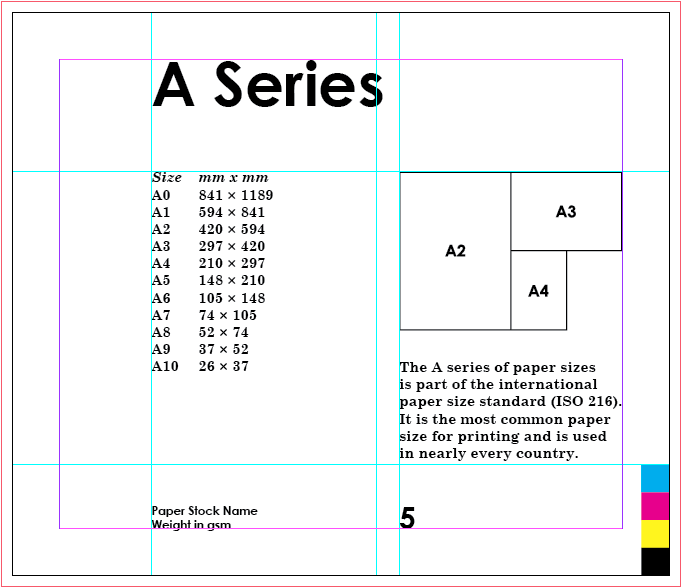
Labels have been added to all of the printing diagrams to make it crystal clear what each component is. They are written in century schoolbook bold italic to tie them in with the rest of the book neatly.
Binding Process has been switched to 'Binding' chapter in its own right.
Each one of the illustrations has been transferred to indesign and then beefed up a bit with a heavier weight. This will help them fit in more with the general aesthetic of the other illustrations.
After finishing the book I re-wrote the main contents page with all of the correct page numbers and added the colourful underline to spice things up.
The document now features 40 pages total with four main chapters.


No comments:
Post a Comment