To illustrate what monotone and duotone looks like to the reader I have used a famous TV loner and a Famous TV duo. Get it? Yeah.
So Tony Soprano represents the Monotone colour. I have split him up into CMYK for anyone printing digital however also explain how you could also use a spot colour.
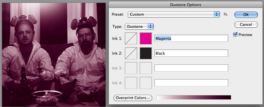
Duotone uses Walt and Jesse in a more metaphorical way, because the duotone is less visible before it is explained.
For example to create the move colour I used Magenta and Black using the duotone options.
These pages show how I have to keep the print book more accessible opposed to a heavy read. I want it to make sense of basic concepts and processes without complicating things unnecessary.


No comments:
Post a Comment