We had a crit on Wednesday for the second part of the History Of brief. I submitted my posters, flyers and tickets from the previous post here.
The first part of the crit involved me writing out some questions that the critiquing partners could look over before writing down strengths, weaknesses and considerations.
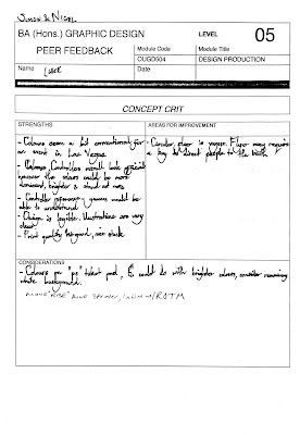
These are the feedback forms I received:
Main Areas for :
- Flyer is too large
- Too much detail in the poster
- Some alignment issues
- Flyer too vague
Main Strengths:
- Like the visual clues towards controllers, buttons etc
- Good colours
- Visuals grab attention
- Good print quality
- Strong illustrations
I'm really happy with the feedback I received, the areas for improvement were very helpful and pointed out some major areas for me to work on, especially around the area of spacing and alignment. Some of my text was too large and ill place and this was all pointed out too. The feedback also suggested the flyers should be smaller and that they could double as beer mats. I did want the flyers smaller but this suggestion added another layer of development which was very helpful.


No comments:
Post a Comment