Tuesday, 2 October 2012
A HISTORY OF... PART 2// Poster Design
For the second part of the 'A History Of..' brief I am creating a Poster, Flyer and some tickets. Firstly the poster. The poster has to be non-A format so I have opted for a square shape. In the images above I have been experimenting with some game console controller inspired shapes and imagery.
By taking the 'X' and 'O' symbols from the playstation controller and the 'A' and 'B' buttons from the X-Box or N64 and arranging them in this circle the viewer can hopefully relate the poster to consoles. I tested the Skinny 'A,B' of the N64 before settling on the fatter Xbox style.
After this I placed all of the vectors I created over the summer in the centre of this circular frame. This give the poster some content which directly relates to the subject of consoles visually and since these vectors represent every important console and handheld ever built, they do this job very well.
I experimented quickly with line weight and positioning.
I realised that I needed to change the colours and experimented with a solid back version before deciding that a gradient would be both interesting and more aesthetic.
The versions obviously went very wrong. This is the result of not using the gradient tool properly and causing the shapes and colours to blend instead of just the colours.
It took a far amount to time to work out how to apply the gradient effectively. Despite this I used my mistakes to mess around with different visual styles, pushing some ideas away from what I wanted to see what would happen. Finally I settled on this Red to blue soft gradient which would colour the shapes and text, not the background.
Happy with the way the imagery worked I set about adding text and information to the poster. This required me shrinking the circular design and placing the text underneath. I did consider overlaying the text however this would have obscured the text and looked messy. I also tried replicating the E3 logo with the extrude and bevel tool in illustrator.
The 3D version of the E3 logo looks very similar to the real life version, hover as the only 3D image on the page it really sticks out and takes attention away for all of the other content.
Here I have added text to the poster. The poster is designed to be hung at the E3 show itself to the viewers will only have to know what the show is about and where within the convention centre you can find it. The gradient is also applied to the text.
Here I put to bed some previous concern I mentioned, flattening the E3 logo to a 2D version so it dint take over the poster. I also added a ROTM or Rise of the Machines, logo to the poster. This will be the shows text based logo and should appear on all of the products.
I added this box to fill all of the white space on the poster. I realised that this area needed some simple decoration.
The box shape reflected the shape of a PlayStation1, I added these two circles to the top corners of the design to further this visual satire.
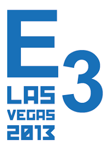
I also upgraded the E3 logo to contain more information to the viewers. This gives the poster some more 'setting' or context for its viewers in college, perhaps for those who wonder what sort of convention E3 is.
Labels:
A History Of,
E3,
OUGD 504,
Summer Brief
Subscribe to:
Post Comments (Atom)


No comments:
Post a Comment