Tuesday, 23 October 2012

PRINT WORKSHOP NOTES// InDesign2

If you work in indesign the page order, the sequence in which pages are printed, will be worked out automatically. If you are screen-printing or something, just make a mock book quickly or draw a diagram.

In the pages list the 'A' in the top corner refers to the master page, when you set a new in design document every page is set on a master page, a blank page, you can add content you want to appear on every page by adding that content to every page. 


These master page text or image boxes will be locked, use cmd, shift and click to add content.

If you place the current page number on the master page, each page will be numbered automatically.

If you want to add a number to both right and left pages, you need to insert the current page number box.

Numbering and sections options will allow you to select which page the numbers will start on.

By selecting 'print booklet', instead of just 'print' you have extra options for the printing of your booklet.

Two-up saddle stitch is your classic book layout.

If the page size is A4 and I also have bleed, I will need to print on larger than A3 paper. This will accommodate the A3 size dps and bleed.

If you create a post-script file all images and text on the document will be saved with the document, rather like a pdf it allows the indesign document complied.

Acrobat Distiller can turn post-script file into PDF.

Tuesday, 16 October 2012

PRINT WORKSHOP NOTES// In Design

Files/ New/ Document. Don't use book, even if you want to make a book.

Make the page the actual size of the document. Use margins to work out printable area.

Click on more options to set up the bleed guide. The most important guide.

When talking to the printer talk about the;
- Paper stock
- Spot colour reference systems
- The bleed they want (3mm standard)

Slug is used for page registration. Defines area outside the page where you will print.

Primary text frame. If you check this then every page will have a text frame added, linked together.


Colour selection works the same as in illustrator. Grey box represented a global colour, change colour in swatch and all colours on page will change. This is true throughout in design.

You an create colour swatches is exactly the same way as in illustrator.

This is also true about picking spot colours or pantone reference.


To add tint swatch simple go to the swatches palette and select 'new tint swatch'.

Biggest problem with in design documents is when images are added incorrectly.

In photoshop you need to make sure your images are
- in CMYK or Greyscale.
- 300dpi and make images actual size they will be on page.
- Save as a PSD or TIFF.
- If PSD make sure you save as transparent document. 

In Illustrator
- Ai can copy and paste as long as its in CMYK
- Vectors means you don't need to worry about resolution.

Select Image/ Place, to place an image on the artboard. You can drag out a box or click to auto place. 

Any spot colours you use in an image in illustrator or Photoshop will be automatically added to your swatch in indesign.

Any image you place has to be saved with your document in one folder.

Vectors will look like low res images, this is to save memory, do not worry.

If you copy and paste directly from illustrator then the vectors will remain vectors.


You can apply any colour you want to a greyscale tiff.
This creates a fake monochrome so be careful.


Create a transparent background in Photoshop to have a transparent background in in design.


Go to window/ output/ separations to gain control of all the colour modes in the document.

 You can use this dialogue box to select individual process and spot colours.


Wednesday, 10 October 2012

PRINT WORKSHOP NOTES// Photoshop

RBG colour mode is the colour mode for working on screen based projects.

When transferring an image you are editing to a print based project you have to convert this colour mode to CMYK. (Unless you spot print)

Click in Image/ Mode/ CMYK to change this setting. 

In the CMYK colour setting some of the filters will not be available.

It is important not to choose colours which conflict with CMYK gamut.

Select View/ Gamut Warning to see which colours will not print.

Image/ Adjustment/ Hue and Saturation. Use to fix this issue.

Also try adjusting the Levels.

You can also use View/ Proof Colours, this will simulate CMYK on an RGB image.

However you can still go out of the printable range in this mode.

For creating work directly in Photoshop you can use the swatches to pick CMYK colours.

Holding down alt and clicking on swatches will delete them from the palate.

You can save swatches and use them in the same way as Illustrator. 


PART 2 SPOT COLOURS

Go to Image/ Mode/ Duotone to select which colours you would like your image to be made up of.

Use the curves to alter the tone and contrast between the colours.

Use the channels menu to alter the individual colours that will be used in printing.

Using these 'Spot Channels'  yow can easily select the correct negatives for screen-printing.

Tuesday, 9 October 2012

PACKAGING// Nets Feedback

Feedback from the Packaging task, which focuses on the production of successful nets for packaging.


Positive:
- Works as a set
- Interesting nets
- Durable nets
- Experimental nets
- Good Colours

Inprovments
- Should have been more adventurous
- On some nets the type is illegible
- Consider spacing for additional information
- Stock variation
- Put more effort into the logo

The structure of this crit resulted in me receiving fairly short and to the point responses. We used post-it-notes so the responses had to be like this. This resulted in many points of positive feedback and also criticism but very little explanation for the views expressed. For example I wonder how I could have put more effort into the logo, given that the logo was an exact copy of the Yellow Card logo? What made the nets interesting?And how I could have improved the stock variation?
Saying this I am aware that on some nets the type was illegible. This was a result of poor planning, which stemmed from not properly testing the nets before producing the final copies. All in all the exercise has been extremely useful in making me aware of the perils of making nets for packaging, in the future planning the construction as well as the design will be integral to a successful product.

A HISTORY OF... // Why I Chose Gaming!

1. I have played and enjoyed computer games for most of my life. From a very young age the technology and entertainment involved in computer gaming has captured my attention and imagination.

2. The industry is booming. Computer gaming is currently the largest entertainment sector, producing way more money than the film or music industries. Despite this many of the industries leading companies are minor start-up operations with people like Notch outselling many of the leading studios like EA simply by being more creative.

3. With the emergence of these minor studios 1000's of potential clients for graphic designers have appeared. By their very nature these studios strive to be different so they don't have to battle with the major labels, as a result they call for fresh branding and interface, an area I am very interested in.

4. There is a whole world of graphic design in the games industry. Literally. 'In-games' graphic design is created to make a virtual world appear more life like and can range to almost all aspects of real life graphic design. Other example appears in the user interface helping the user navigate through menus and features. 

5. Related to the previous point 'real world' graphic design for the games industry covers many aspects also. From Box design to special promotional packs, Show design, web design, packaging, manuals, etc.

6. The gaming industry is a creative industry and I thought it would be interesting to work with other creatives who don't necessary have the same skills but do understand the creative process.

7. The technological aspect of the games industry relates to my interest in science and technology. The games industry is pushed by development in technology and visa versa, I'm interesting in how the two interact.

8. Computer games often contain aspects, stories, dialogue that involve social or political issues that I take interest in. For example GTA4 covers aspects of the rich poor divide in New York City and by extension America and the western world as a whole. More direct games like 'The Political Machine 2012' cover the presidential elections in a satirical humour.

9. The industry is constantly changing and evolving, reflecting current trends and fashions, i've played computer games long enough to understand a lot of these.

10. Computer games encompass every form of art into one media. A high end game will contain artwork, acting, storytelling, music, visuals, graphics, animation, comedy, photography and film.

PRINT WORKSHOP NOTES// Illustrator


When designing for print work in CMYK.

CYMK is also known as 'Process colours'.

Use the swatches palate to consistently apply the same colour throughout artwork and documents. This will not work if you have to use the colour picker every time.

You can use the 'select all unused' option to quickly delete all of the colours you are not using on an artboard. Leaving only the colour in use already on the artboard.

For fine control of CMYK you can use the percentages sliders.

Use the options to select create new swatch to add a new swatch to the palate. You can name the colours colloquially but it would be better to leave the names as percentages. 

Change the swatch view by right clicking on the swatch panel. You can view information about the swatches here too.

You can apply colour to artwork as you create it and use these colours as a 'live' colour palate.

You can set up a swatch palate by selecting the 'select swatch used' option. The  new palate will contain all of the colours in your artboard. 

In swatch options menu the word 'GLOBAL' applies to the colour of all colours on the artboard. For example a global colour being edited will result in all examples of that colour on the artboard being edited also.

You can enter 'Tints' to the swatch palate. This will help if you want to make an artwork with one colour/ monochrome artwork.

Spot colour printing is a print method where a specific coloured ink is applied to the page rather than mixing CMYK. This advantage is the CMYK range is limited, extra colours can be printed.

When choosing colours remember to consider print costs. Chose Monochrome or two colours to reduce costs. Another advantaged of spot colours is that ink can be pre-mixed and only one plate will be used.

Specifying spot colours with pantone allows for printers all over the world to use universal colour swatches. Branding finds this specifically important.

Swatch palates (like pantone swatches) can be selected from the swatches menu!

With the pantone swatches you can search for industry specific colours and use them in your artwork.

Save swatch as ASE (adobe swatch exchange) to export swatches to InDesign or Photoshop.


There seems to be an issue in CS6 were the tints of the swatches are not transferred...

MUY BUENO!

Monday, 8 October 2012

PACKAGING// Printed Nets

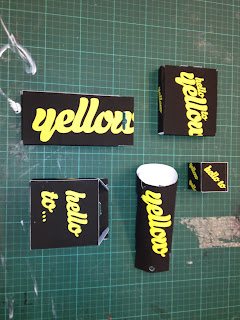
Today I printed and crafted my nets with the 'Yellow Card' logo on. The nets are basically all small versions of their real life counterparts. The black and yellow colour printed well which was a bonus and the matt stock folded well and was structurally sound.  
This small gift box was my favourite to build with a very efficient design, only one part is glued and its visually appealing too.

 This box was a bit of a fail. The net was too long on one side for some unknown reason, resulting in an arching of the top side.

 This phone cover case was also very easy to construct and has a very appealing design, with some extra features like the cutout and hanging hole.


Sunday, 7 October 2012

PACKAGING// Net Design

 The new task is to take the nets and one logo, and apply said logo to every net. I'm using the 'Hello to Yellow' slogan for the Yellow Card. I took this logo from the Scream Pub site and live traced it into illustrator so I could apply it to the nets. I'm not a huge fan of the design, however out of the collection I had to choose from it was my favorite. I thinks its fairly simple design and I'm not a huge fan of script fonts.

 These are the nets I will work with, they represent a good mixture of different product and packaging design and should give me some interesting, and different shapes to work with.

 This should fold into a Chinese takeaway style box. The "Hello To' text will appear on the front face and 'Yellow' will wrap around the other three. I have gone for black and yellow design in the style of the solid black and yellow card itself.


 This is a mobile phone case. The front side is mostly black with the full logo shrunk down to the top left corner. The reverse of the box is covered in the Yellow text.

 This is a simple box net. The 'Hello To' text will print on the top and bottom of the box and the 'Yellow' text repeats as a wrap around on all other sides.

This is a small elongated box shape. The Main logo will print on the lid of the box with a small 'Yellow' printed on the three sides closest to the front. This should give maximum exposure of the logo if it appeared in the shelf.


 This is one of the more elaborate net, designed to carry/ display pairs of socks. The large yellow text should print up the back of the net with the small full logo printing on the front side.

This is the print layout sheet. I will print this on A2 paper, each net will be around the size of an A4 sheet with an exception of the simple box net which will be much smaller. I'm not printing the nets with any guide lines as some people are because I don't want them to show up on construction, however this will make the construction of the nets harder so it has been a part trade off.  Hopefully taking care during construction will result in good quality nets without printed guidelines.

Saturday, 6 October 2012

PACKAGING// Logos for Nets

Continuing from the previous task we de-constructed our nets and set about testing the logos we collected on them. I set about sketching out some initial designs onto 2D nets.

I finished two sheets, one of which is here:
The test was to work out something experimental that we could use for 5 real nets that will be up here soon!

PACKAGING// Print Packaging and Logos

 To get a better understanding of the variety of packaging that is available to the consumer we each found 5 examples and laid them out on a table.
 We wrote down a list of 7 factors which dictate whether we consider packaging design to be good or bad.
We then placed the packages in order from low to high, denoting how good we thought the overall designs were, based on the criteria above. The result was surprising because we rated the vast majority as low or medium and a very select crop as high quality. I suppose as students who are surrounded with high class design we find in research we don't find mass produced packaging very exciting or inventive.

Friday, 5 October 2012

A HISTORY OF... PART 2// Poster, Flyers and Tickets// Feedback

We had a crit on Wednesday for the second part of the History Of brief. I submitted my posters, flyers and tickets from the previous post here.

 The first part of the crit involved me writing out some questions that the critiquing partners could look over before writing down strengths, weaknesses and considerations. 

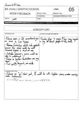
 These are the feedback forms I received:

Main Areas for :
- Flyer is too large
- Too much detail in the poster
- Some alignment issues
- Flyer too vague

Main Strengths:
- Like the visual clues towards controllers, buttons etc
- Good colours
- Visuals grab attention
- Good print quality
- Strong illustrations

I'm really happy with the feedback I received, the areas for improvement were very helpful and pointed out some major areas for me to work on, especially around the area of spacing and alignment. Some of my text was too large and ill place and this was all pointed out too. The feedback also suggested the flyers should be smaller and that they could double as beer mats. I did want the flyers smaller but this suggestion added another layer of development which was very helpful.

Thursday, 4 October 2012

A HISTORY OF PART 2// Posters, Flyers, Tickets// PRINT

I'm fairly happy with the the print results of the three items, especially the poster. Like all designs after print the designs did take on different colours and therefore appearance to some extent.

The print came out with much darker colours than when designing. This could have been a side effect of mixed up colour profiles when converting from CS5 to CS6 in college, an unwanted side effect. For example the yellow gradient of the ticket here is solid print yellow in theory but printed with a very mottled effect.  Still the gradient printed fairly well here with an equal amount of orange and yellow.

...unlike the flyers. The print quality here was severely reduced, I suppose because the colours were not as suitable to print. Here, a large amount of the flyer is coloured green and the blues are not well represented. An issue I did have with the flyers is that I feel they are far too large, I would have liked to have had them printed at around half the size. This problem arouse when I got the the print room with an A2 layout for print. At the last minute I chose to switch to A1 because I felt that the poster and tickets would be too small and as a result of time restraints could not resize the design.


The poster was the best result, its large size allowed for a smooth gradient transition. The colours came out deeper than in the digital design but with a solid tone non the less. The fine lines  of the illustrations came out well too.


Wednesday, 3 October 2012

A HISTORY OF... PART 2// Print and Screen

This is the A1 print layout for the three products. Seeing them all together has restored confidence in the designs for me. They both work as a set and individually. They are also unlike anything I have created before with a pretty crazy use of colour.

The colours where chosen to reflect the shows setting, Las Vegas. Here I have created a screen preview of the work with LV as the background.

Tuesday, 2 October 2012

A HISTORY OF... PART 2// Tickets Design

Knowing that the shape of the ticket would be a controller I trace one out and applied a gradient straight away.  The gradient here is a bit more intense that the others so I will probably tone it back a bit before finalising. I chose a PlayStation controller because I believe it is the most instantly recognisable shape, with a good amount of area to work with design wise.
I tested this lined version to see if the gradient would be less intense but it looks pretty poor like this.
I added a slightly altered version of the Square, Triangle, A, B logo to the right hand side of the ticket and the ROTM logo to the other. I also changed the solid colour to a simple outline.


I applied the gradient to the whole design to finish this item, this will allow the three to work as a set while being distinguishable at the same time.

A HISTORY OF... PART 2// Flyer Design

I used the same visuals (console controller/ gamepad) from the poster here on the flyer. The flyer will be cut out as a circle unlike the poster, but the design will be similar. I used the same square, triangle, A, B design and also added a cross shape connecting the four, the cross is a repeated design style used in controller design.

I tried to create these diagonal lines to represent a circuit board or any kind of electrical intricacies. I also added all of the same information that appeared on the poster to the flyer design.

 I chose to use this light blue to green gradient for the colouration of the flyer. These colours relate the flyer to the poster.

On applying the gradient I decided that all of the lines created too much noise on the page, I reduced this problem by adding some solid blocks of colour two of the sides.